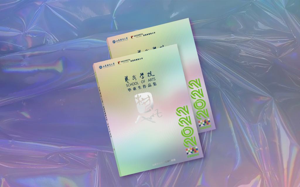
EXHIBITION PREFACE
———— 展 览 前 言 ————
在山东财经大学建校70周年暨合并建校10周年之际,2022届美术学(艺术品投资与鉴定、艺术金融)、设计学(视觉传达设计、广告学)两个专业(四个专业方向)的近120名同学也行将完成本科四年的学习,迎来毕业的日子。在经历了新一波疫情的考验后,艺术学院师生还是克服困难,顺利完成了毕业论文答辩、毕业创作(设计)等常规工作,并与往年一样,在线下举办艺术学院毕业生作品展,出版毕业生作品集。
近年来,在学校领导和相关部门的大力支持下,在学院班子、师生的共同努力下,艺术学院实现了较大发展:三个专业全部获评为省级一流本科专业,成功获批艺术专业硕士点,新的院址基本建成并投入使用。应该说,学院的平台建设、硬件设施、软实力等方面都得到较好的改善、提升,并且拥有了一流的美术馆。以上的变化、发展,也赋予了今年的毕业展览几个特别之处:其一,这是艺术学院搬迁新址以来的第一个毕业作品展;其二,这是山东财经大学海岱美术馆开馆以来的第一个毕业作品展。
本届展览是我校第一次联合国外大学共同举办艺术专业毕业生作品展。近年来,在学校国际交流与合作处的支持下,艺术学院与美国拿撒勒大学艺术学科在学生深造、学术讲座、授课等领域建立了多元化的合作模式。2021年,双方开启了以“共生”作为主题的艺术展览及学术研讨活动。今年,我们继续延续这一主题,将此次活动定名为“共生·2022山东财经大学与美国拿撒勒大学艺术专业毕业作品展”,并进行线上学术研讨会。同时,我们也会将所有毕业生的展览作品结集成册。这些系列活动的举办,标志着我院国际合作办学又迈出了坚实的一步。也许,这些毕业生的作品并不十分成熟,但却凝结了两校130余位艺术专业本科毕业生在不同社会、文化背景下对于自身专业学习的审慎思考。从这个角度上来说,这些具有探索性的作品是殊为可贵的。
美好的大学四年行将结束,同学们也即将走向新的工作、学习环境,并开启崭新的人生旅途。愿各位同学此去前程似锦,再相逢时我们初心如故!
宋述林 杨扬
EXHIBITION INFORMATION
———— 展 览 信 息 ————
展览时间:2022年5月26日—5月31日
展览地点:山东财经大学海岱美术馆
开馆时间:周二-周日 9:00-17:00
ART APPRECIATION
———— 优 秀 作 品 欣 赏 ————
山 东 财 经 大 学
美/术/学
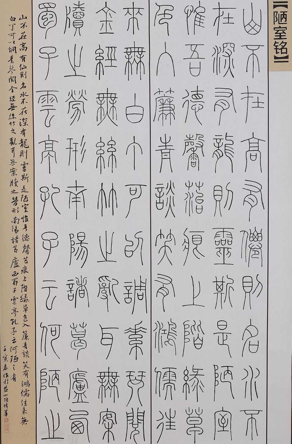
作品名称:陋室铭 | An Epigraph in Praise of My Humble Home
作者:张倩华 Zhang Qianhua
指导教师:李峰 Li Feng
材质:纸本 paper
创作时间:2022 年 4 月 April,2022
尺寸:138×69(cm)
作品分类:书法 calligraphy
创作说明:
小篆书 《陋室铭》释文:山不在高,有仙则名:水不在深,有龙则灵。斯是陋室,唯吾德馨。苔痕上阶绿,草色入帘青。谈笑有鸿儒,往来无白丁。可以调素琴,阅金经。无丝竹之乱耳,无案牍之劳形。南阳诸葛庐,西蜀子云亭。孔子云:“何陋之有? ”
Description:
The calligraphy is in seal script and derived from an article of Tang literatus Liu Yuxi.The author who wrote it expressed his spirits of dwelling in modest lifestyle and being secluded from the busy world.
视/觉/传/达/设/计
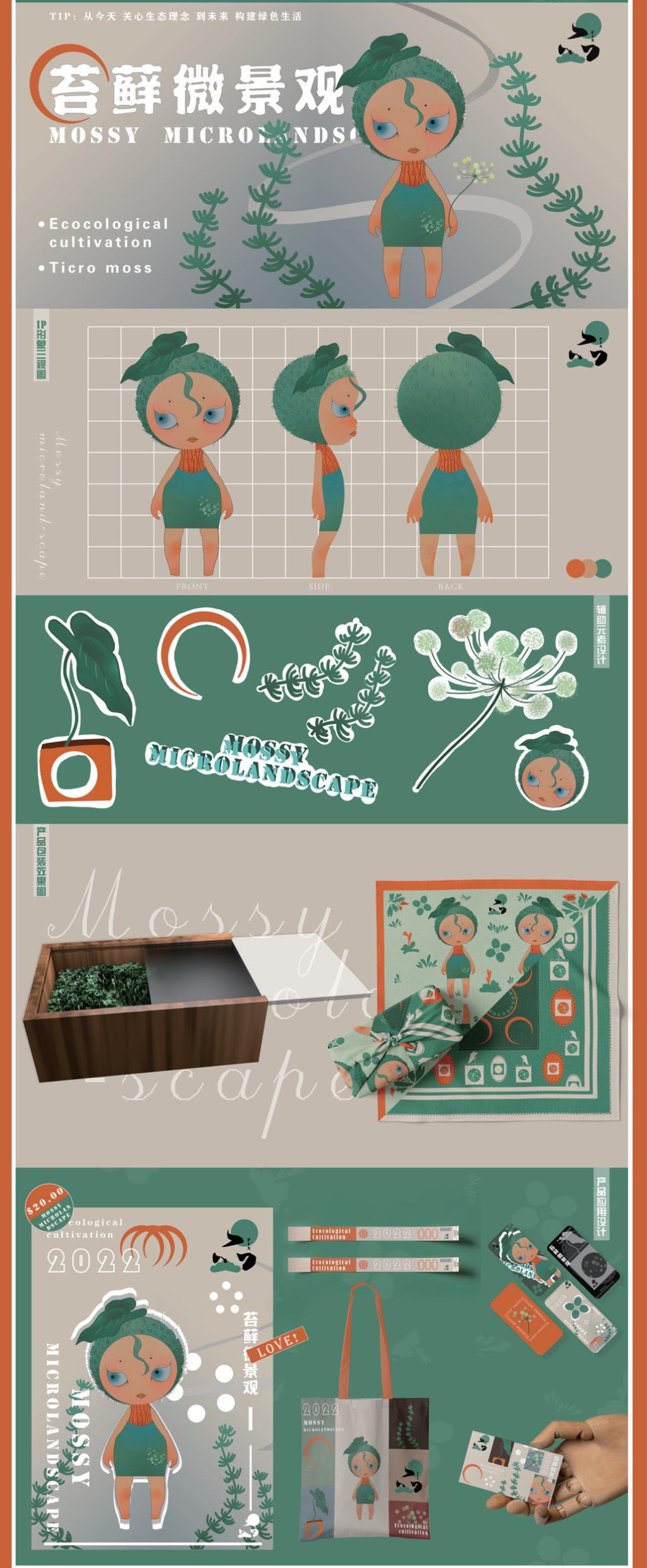
作品名称:苔藓微景观“品”的包装设计 | The Packaging Design Of MossMicrolandscape "Product"
作者:史珂 Shi Ke
指导教师:吴春华 Wu Chunhua
媒材:木制材料 玻璃材料 真丝面料 胶版印刷 松墨印刷等 Wooden Materials,Glass Material,Real Silk Fabrics, Offset Printing, Ink Printing
创作日期:2022 年 3 月 14 日
尺寸:20×13×7(cm)
研究领域:包装设计 Packaging Design
创意说明:
生态理念下的包装设计是包装产业发展的必然走向。在消费盛行时代下,存在人们对生态理念的忽视以及对产品内涵理解的消逝等相关问题。此次设计正是针对以上情况,以生态理念为切入点,对生态理念下产品包装进行实践性设计——苔藓微景观的包装设计。本次设计目的是运用苔藓微景观来对生态理念进行传扬,并为包装设计提供一种新的绿色设计理念,为消费者提供一种最容易且最广泛的接受方式来增强对生态理念的理解。
Description:
Packaging design under ecological concept is the inevitable trend of packaging industry development. In the era of consumption, there are related problems such as people's ignorance of ecological concept and the disappearance of the understanding of product connotation. In view of the above situation, this design takes the ecological concept as the entry point to carry out the practical design of product packaging under the ecological concept -- the packaging design of moss micro-landscape. The purpose of this design is to use moss micro landscape to spread the ecological concept, and provide a new green design concept for packaging design, to provide consumers with the easiest and most widely accepted way to enhance the understanding of ecological concept.
美 国 拿 撒 勒 大 学
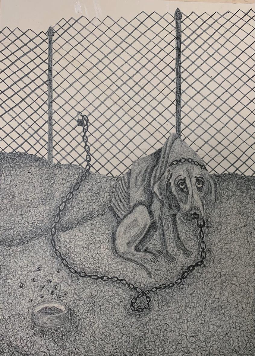
Title: Chains Of Misery | 痛苦的锁链
Name:Alexandrea Bianchi 亚历山德拉·比安奇
Instructor: Ron Netsky
Medium: Lithography 平版印刷
Date of Completion: 2021
Size: 12in x 16in
Area of Study: Printmaking 版画
Creative Idea Behind the Project (Artist Statement):
My Thesis revolves around how humans are impacting the lives of innocent animals negatively in the world. This includes abuse, global warming issues, deforestation, how animals are treated in meat factories, and so on. I expose the selfishness of the human race when it comes to the lives of animals within my work. Humans will always put themselves first without a thought of how it will impact other innocent lives around them. In this specific piece, I am showing how some people treat animals they own by starvation, neglect, and abuse.
创作说明:
我的研究围绕人类如何对世界上无辜动物的生活产生负面影响展开。这包括虐待、全球变暖问题、森林砍伐、肉类工厂如何对待动物等等。在我的作品中,当涉及到动物的生活时,暴露了人类的自私。人类总是把自己放在第一位,而没有考虑到这将如何影响周围其他无辜的生命。在这个作品中,我展示了一些人如何通过饥饿、忽视和虐待来对待自己的动物。
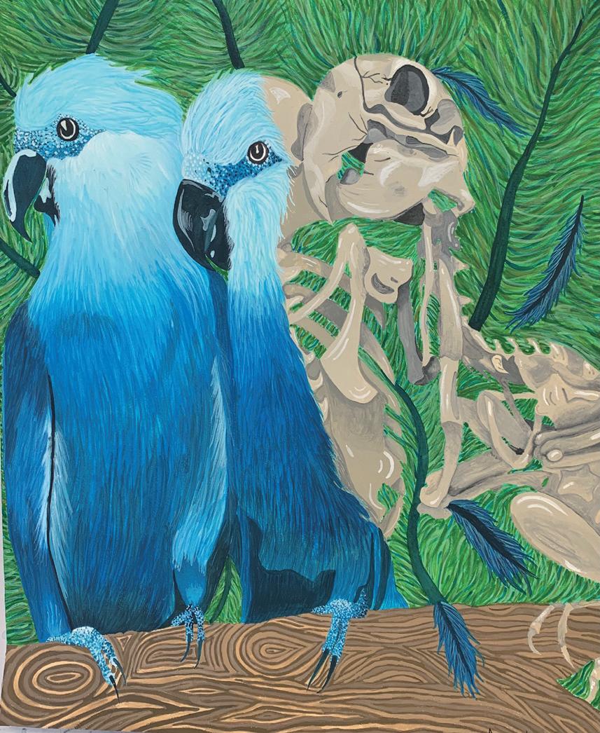
Title: Extinction of the Blue Macaw | 蓝金刚鹦鹉的灭绝
Name:Alexandrea Bianchi 亚历山德拉·比安奇
Instructor: Ron Netsky
Medium: Gouache 水粉
Date of Completion: 2021
Size: 20in x 22in
Area of Study: Painting 绘画
Creative Idea Behind the Project (Artist Statement):
My Thesis revolves around how humans are impacting the lives of innocent animals negatively in the world . This includes abuse , global warming issues , deforestation , how animals are treated in meat factories , and so on . I expose the selfishness of the human race when it comes to the lives of animals within my work . Humans will always put themselves first without a thought of how it will impact other innocent lives around them . The blue Macaw was a beautiful tropical bird who unfortunately is now extinct . If we keep treating wildlife the way we do , we wil keep losing animals just as beautiful and innocent as this one .
创作说明:
我的研究围绕人类如何对世界上无辜动物的生活产生负面影响展开。这包括虐待、全球变暖问题、森林砍伐、肉类工厂如何对待动物等等。在我的作品中,当涉及到动物的生活时,暴露了人类的自私。人类总是把自己放在第一位,而没有考虑到这将如何影响周围其他无辜的生命。蓝金刚鹦鹉是一种美丽的热带鸟类,不幸的是现在已经灭绝。如果我们继续以这样的方式对待野生动物,我们将继续失去像这样美丽和无辜的动物。
ART APPRECIATIO
———— 作 品 欣 赏 ————
山 东 财 经 大 学
美/术/学

作品名称:定风波 | Staedy Storm
作者:贺紫泽 He Zize
指导教师:杨宁 Yang Ning
材质:纸本 paper
创作时间:2022 年 4 月 12 日 April 12,2022
尺寸:180×49(cm)
作品分类:书法 calligraphy
创作说明:
篆书;内容是苏轼的《定风波·莫听穿林打叶声》;莫听穿林打叶声,何妨吟啸且徐行。竹杖芒鞋轻胜马,谁怕?一蓑烟雨任平生。料峭春风吹酒醒,微冷,山头斜照却相迎,回首向来萧瑟处,归去,也无风雨也无晴。
Description:
The content is Su Shi's " Calming the Waves "; Listen not to the rain beating against the trees.Why don’t you slowly walk and chant at ease?Better than saddled horse I like sandals and cane.O I would fainSpend a straw-cloaked life in mist and rain.Drunken, I’m sobered by vernal wind shrillAnd rather chill.In front I see the slanting sun atop the hill;Turning my head, I see the dreary beaten track.Let me go back!Impervious to wind, rain or shine, I’ll have my will.
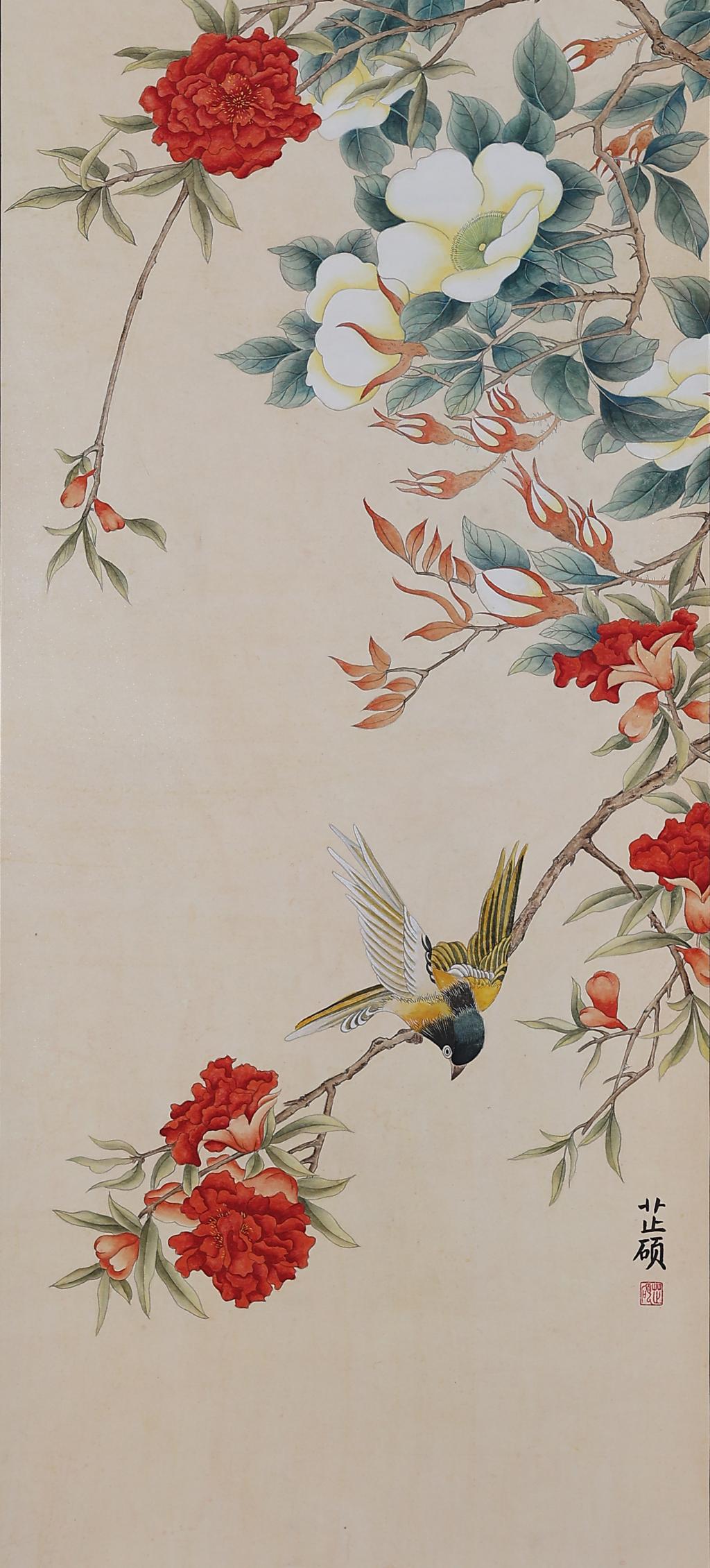
作品名称:花与鸟 | Flowers And Birds
作者:许芷硕 Xu Zhishuo
指导教师:杨宁 Yang Ning
材质:纸本 paper
创作时间:2022 年 4 月 April,2022
尺寸:138×68(cm)
作品分类:中国画 Chinese paintings
创作说明:
花与鸟是中国画的传统题材, 我沿用了这一题材进行创作,将花、鸟和谐地融入画面,在配色上,也选择了传统的朱砂、藤黄、三绿,使画面古朴自然、宁静悠然。
Description:
Flowers and birds are the traditional theme of Chinese painting, which I use for creation, blending flowers and birds into the picture harmoniously. In terms of color matching, I also choose the traditional cinnabar, garcinia and three greens, making the picture simple, natural and serene.
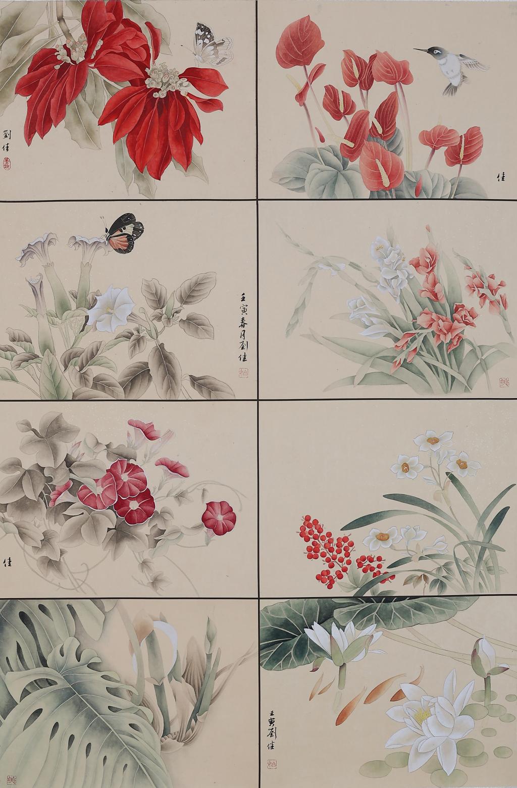
作品名称:依依向物华 | Longing for spring
作者:刘佳 Liu Jia
指导教师:石以品 Shi Yipin
材质:纸本 paper
创作时间:2022 年 3 月 March,2022
尺寸:45×34×8(cm)
作品分类:中国画 Chinese paintings
创作说明:
此画作运用工笔绘画的创作方式描绘景物,每幅大小为四尺六开,共八幅。作品的设色较为鲜艳明亮,多为描绘花草以及昆虫和鸟类等生物,简单生趣。
Description:
The painting is in the style of a brush painting, each measuring 34*45cm, making eight panels in total. The colour palette is bright and vibrant, and the paintings are simple and interesting, depicting mostly flowers and plants, as well as insects and birds and other creatures.
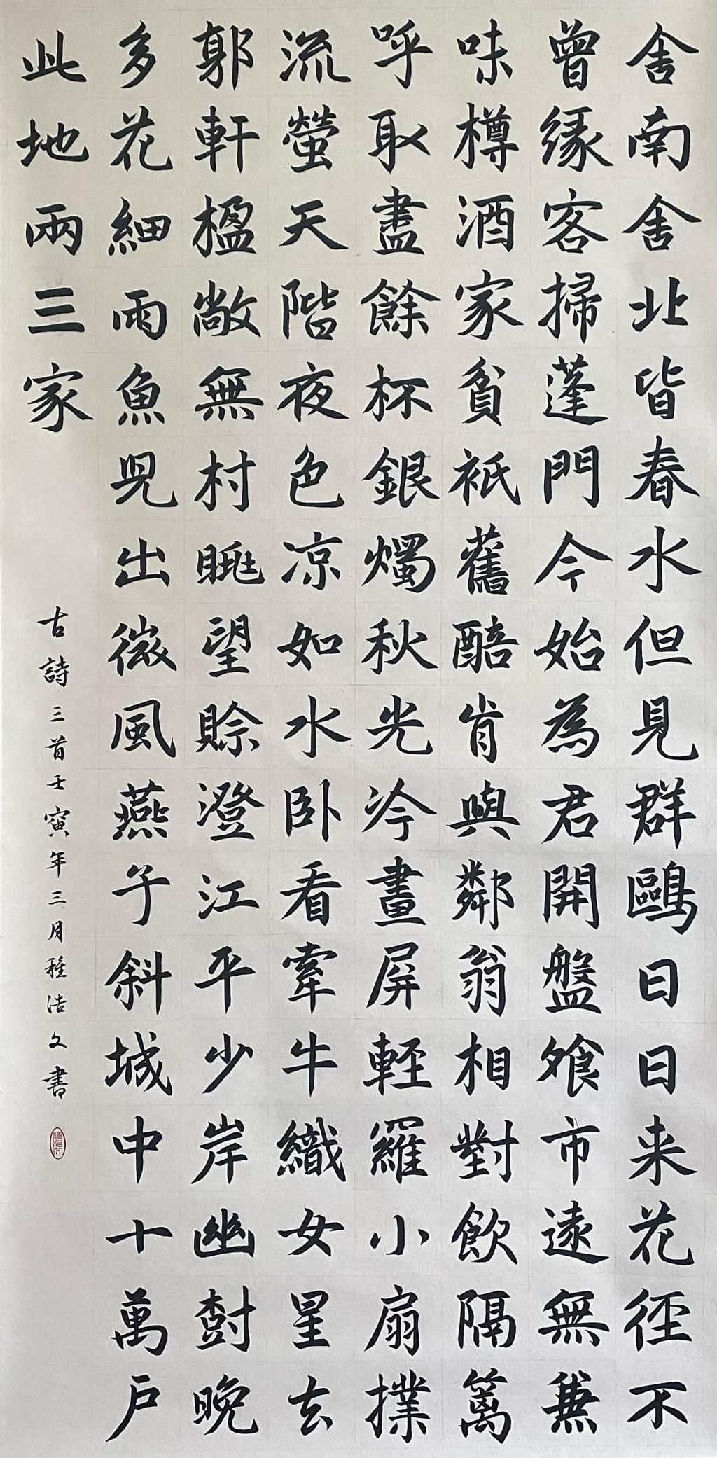
作品名称:古唐诗三首 | Three ancient Tang poems
作者:种浩文 Zhong Haowen
指导教师:石以品 Shi Yipin
材质:纸本 paper
创作时间:2022 年 3 月 March 3,2022
尺寸:138×69(cm)
作品分类:书法 calligraphy
创作说明:
书法为楷书。内容按顺序分别为唐代现实主义诗人杜甫所作《客至》、唐代杰出诗人杜牧所作《秋夕》,及杜甫诗作《水槛遣心(其一)》。
Description:
The calligraphy is regular script. The contents are, in order, "Guest Arrival" by the Tang Dynasty realist poet Du Fu, "Autumn Evening" by the outstanding Tang Dynasty poet Du Mu, and Du Fu's poem " Relaxation at the Water Threshold (Part 1)".
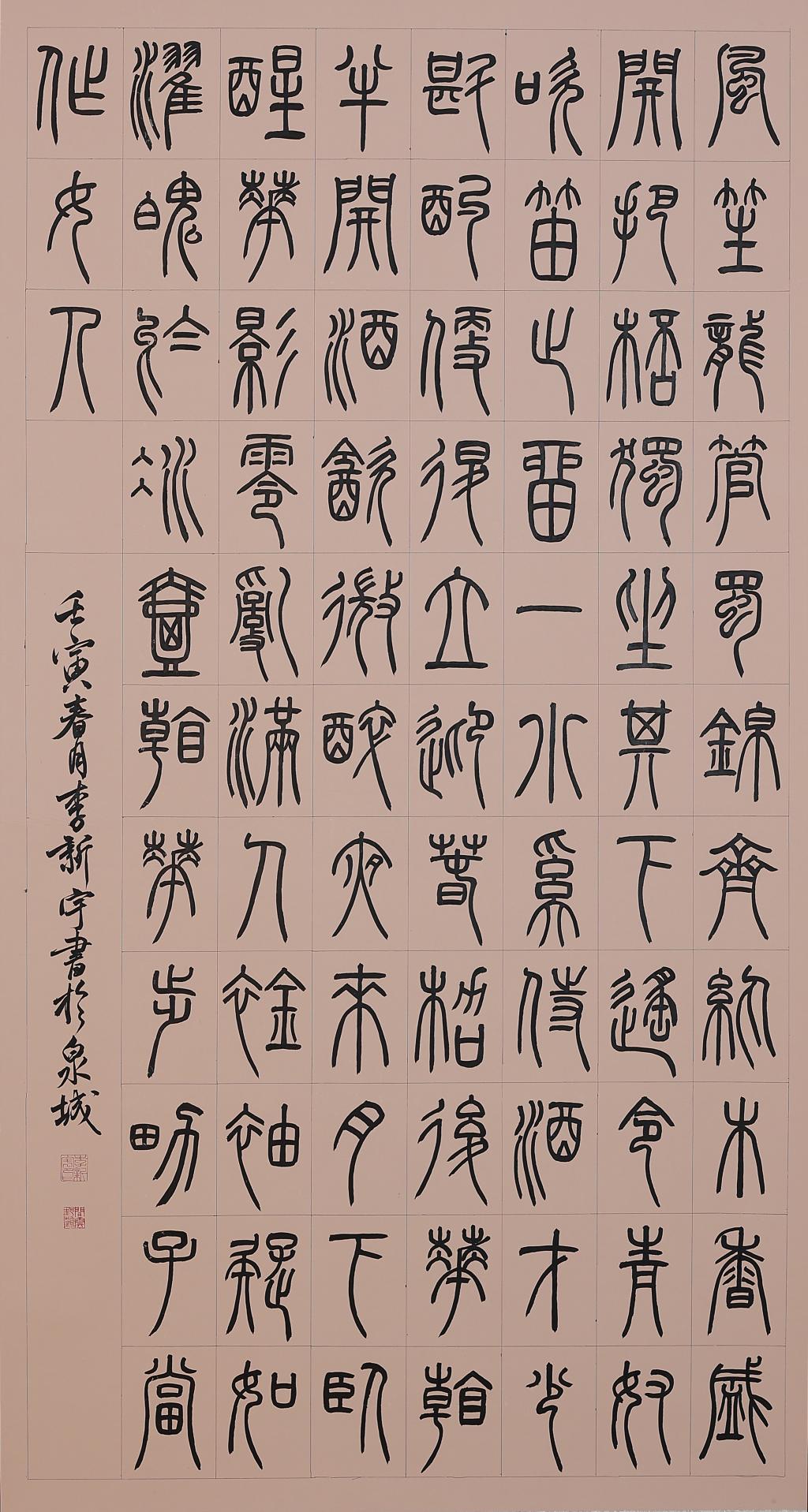
作品名称:小窗幽记节选 | Seal script Sketches by the Little Window
作者:李新宇 Li Xinyu
指导教师:高远 Gao Yuan
材质:纸本 paper
创作时间:2022 年 3 月 March,2022
尺寸:180×96(cm)
作品分类:书法 calligraphy
创作说明:
风笙龙管,蜀锦齐纨。木香盛开,把杯独坐其下,遥令青奴吹笛,止留一小奚侍酒,才少斟酌便退,立迎春架后。花看半开,酒饮微醉。夜来月下卧醒,花影零乱,满人襟袖,疑如濯魄于冰壶。看花步男子当作女人。
Description:
When the wood fragrance is in full bloom, he sits alone under the cup and orders the green slave to play the flute. He stops waiting for a attendant to serve the wine. Only after less consideration, he retreats and stands behind the spring greeting frame. The flowers are half open, and the person is slightly drunk. When I wake up at night under the moon, the shadow of flowers is messy and full of people's sleeves. I doubt it is like washing my soul in a curler. Look at a man as a woman.
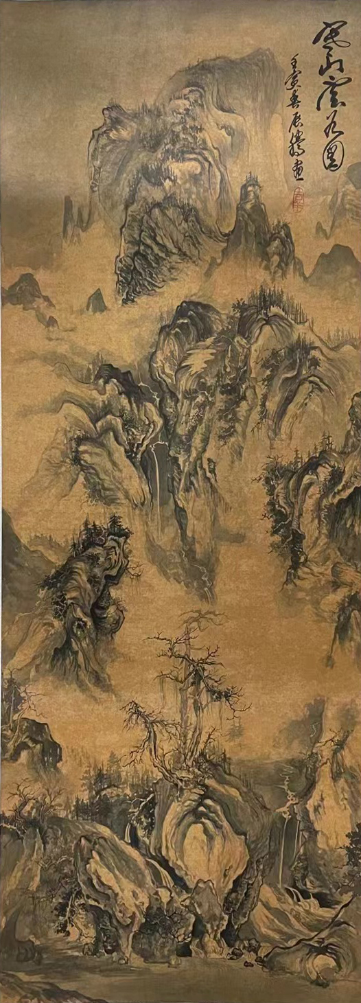
作品名称:寒山云谷图 | Yunshan Cold Valley
作者:张辰腾 Liu Huixin
指导教师:宋述林 Song Shulin
材质:纸本 paper
创作时间:2022 年 3 月 March,2022
尺寸:144×56(cm)
作品分类:中国画 Chinese paintings
创作说明:
此图取高远之景,草木萧瑟,深山冬日荒寒,幽谷深邃,树木耸立,枝权横生,树叶凋零,似到深秋或隆冬季节
Description:
This picture takes the high scenery, bleak vegetation, remote mountains in cold winter, deep valley, standing trees, branches, leaves withered, which looks like late autumn or mid-winter.
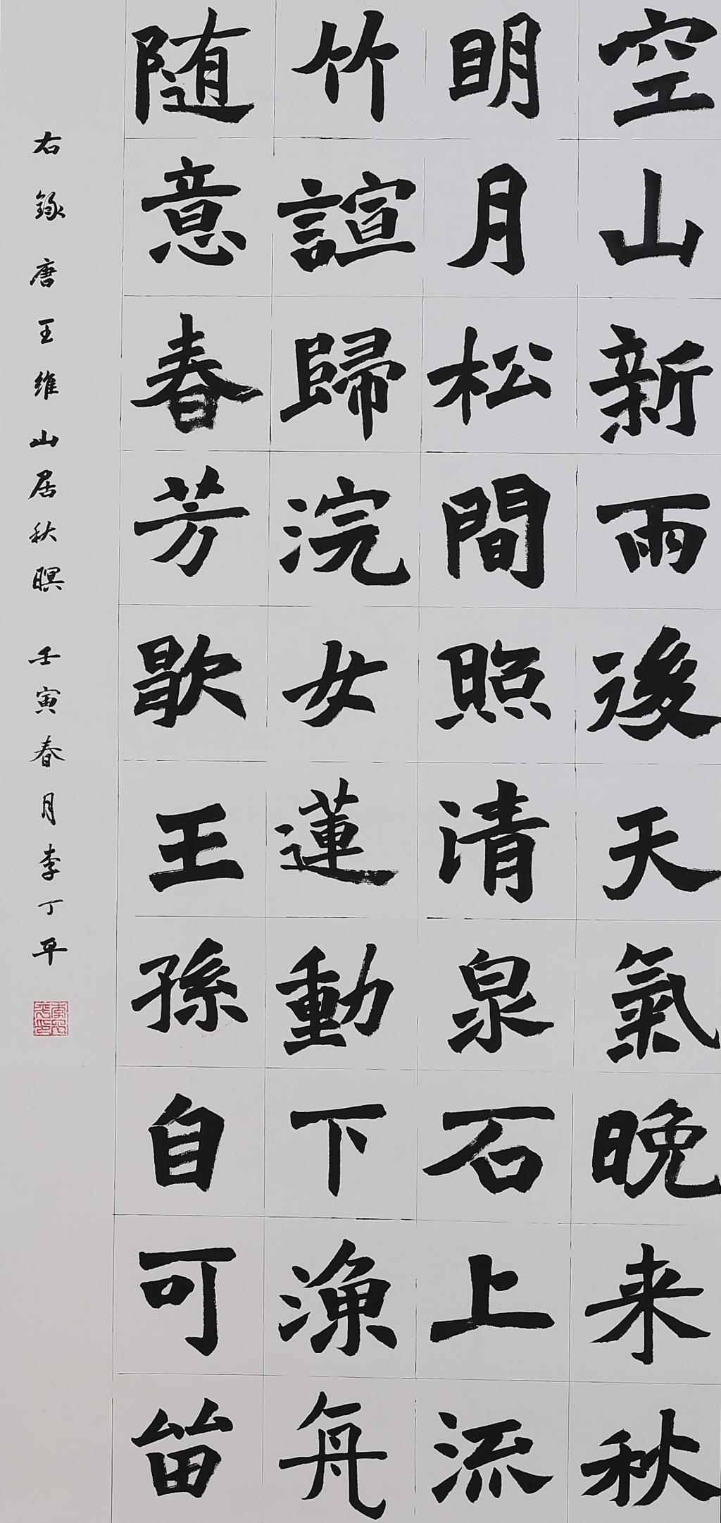
作品名称:山居秋暝 | An Autumn Evening In The Mountains
作者:李丁平 Li Dingping
指导教师:杨宁 Yang Ning
材质:纸本 paper
创作时间:2022 年 3 月 March,2022
尺寸:138×68(cm)
作品分类:书法 calligraphy
创作说明:
书法为楷书偏魏碑。书写内容为:空山新雨后,天气晚来秋。明月松间照,清泉石上流。竹喧归浣女,莲动下渔舟。随意春芳歇,王孙自可留。
Description:
AN AUTUMN EVENING IN THE MOUNTAINS After rain the empty mountainStands autumnal in the evening,Moonlight in its groves of pine,Stones of crystal in its brooks.Bamboos whisper of washer-girls bound home,Lotus-leaves yield before a fisher-boat --And what does it matter that springtime has gone,While you are here,O Prince of Friends?
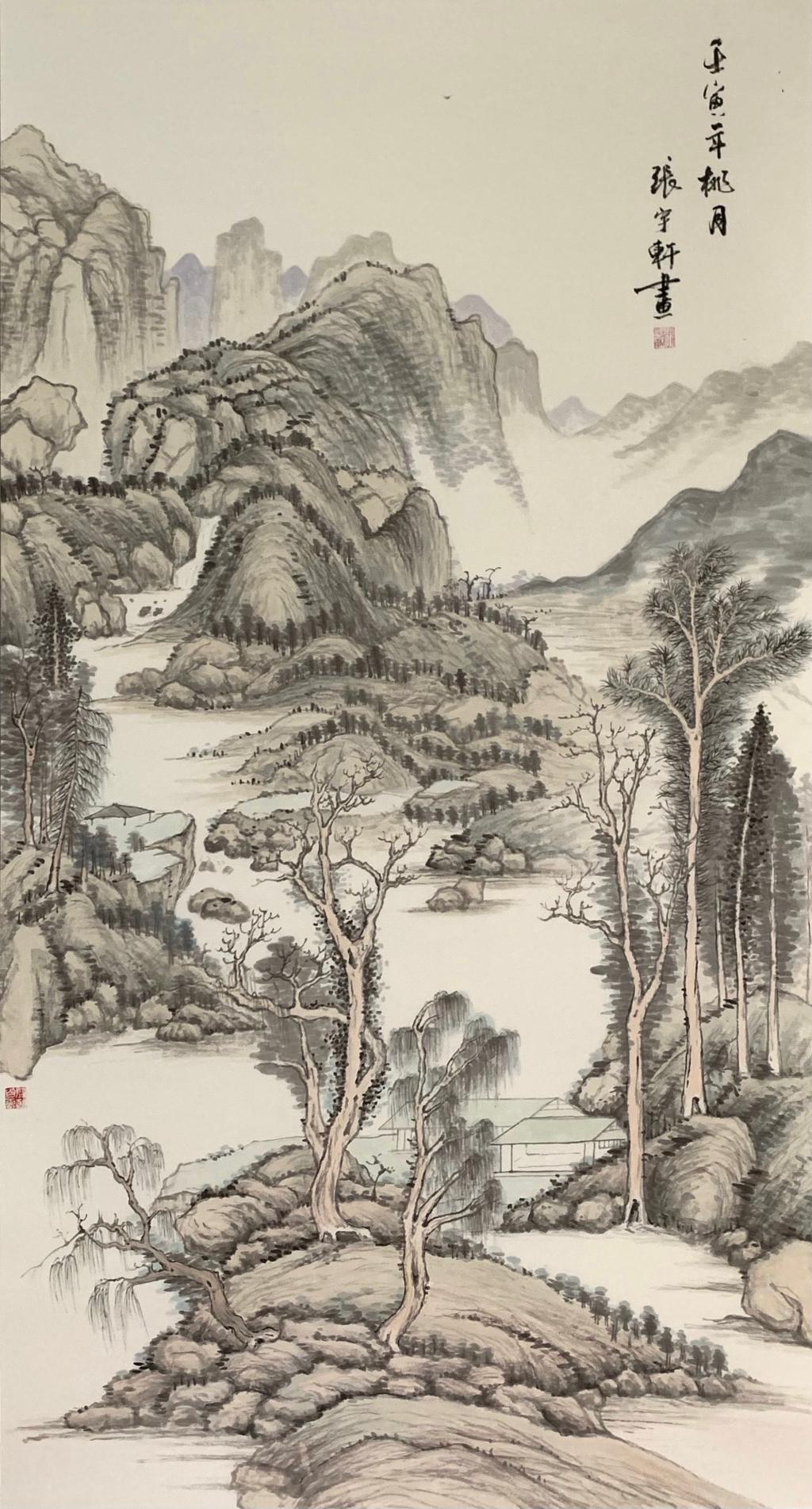
作品名称:春山丛林图 | Jungle in Spring mountain
作者:张宇轩 Zhang Yuxuan
指导教师:李峰 Li Feng
材质:纸本 paper
创作时间:2022 年 3 月 March,2022
尺寸:180×97(cm)
作品分类:中国画 Chinese paintings
创作说明:
在元代文人多以画自娱, 中国文人画成为元代画坛主流,而史称“元四家”的黄公望、吴镇、倪瓒、王蒙的山水画成就最为突出,该画运用古法描绘春山之景以表达对元四家之敬
Description:
In the Yuan Dynasty, literati mostly entertained themselves by painting, and Chinese literati painting became the mainstream in the Yuan Dynasty. The achievements of landscape painting of Huang Gongwang, Wuzhen, Ni Zan and Wang Meng, who were known as the "four schools of Yuan", were the most prominent. The painting used the ancient method to depict the scenery of spring mountain to express their respect for the four schools of yuan.
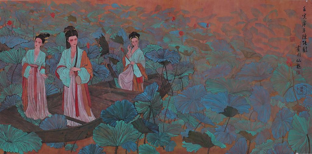
作品名称:荷池仕女图 | Lady Lotus Pond
作者:陈张毅 Chen Zhangyi
指导教师:李峰 Li Feng
材质:纸本 paper
创作时间:2022 年 3 月 March 3,2022
尺寸:160×96(cm)
作品分类:中国画 Chinese paintings
创作说明:
毕业创作的灵感来源于当今的环境,希望人与自然之间的共更加融洽。作品借鉴了何家英老师的线条,着色上受到了王希孟的《千里江山图》的启发。
Description:
Inspired by today’s environment, I hope the coexistence between human and nature will be more harmonious. Drawing on He Jiaying’s lines, the painting is colored after Wang Ximeng’s painting of A Panorama of Rivers and Mountains.
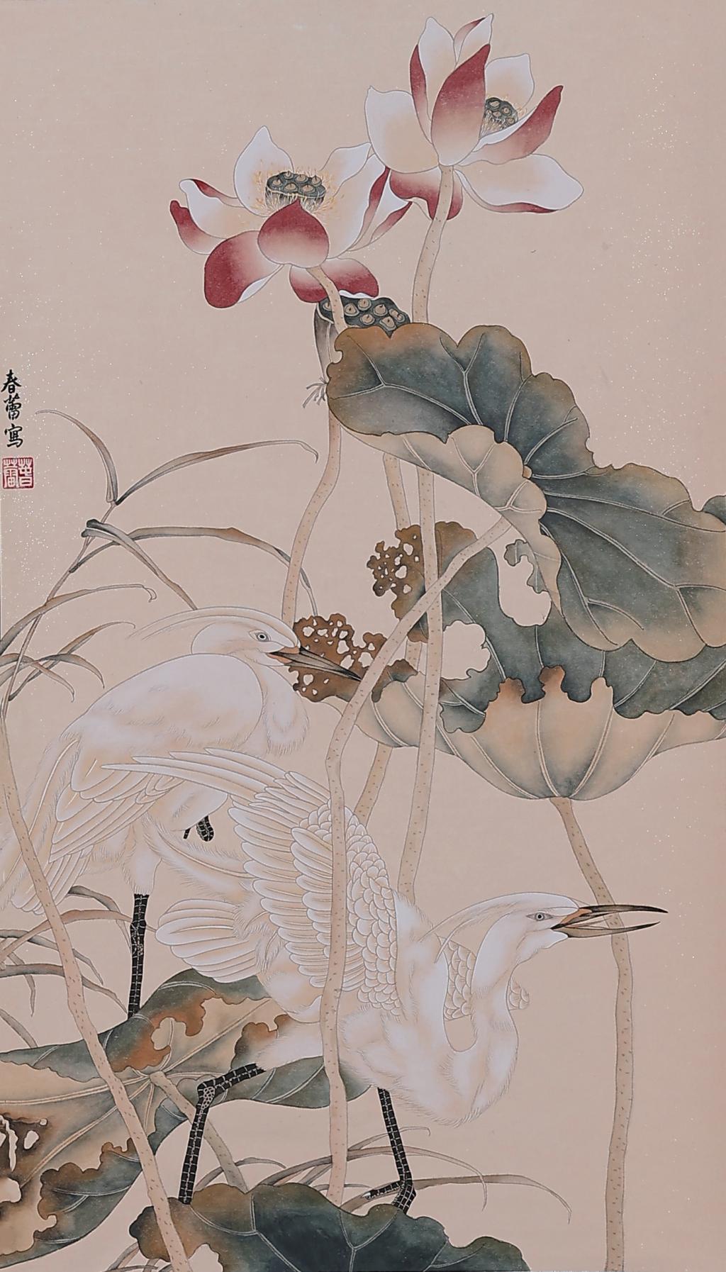
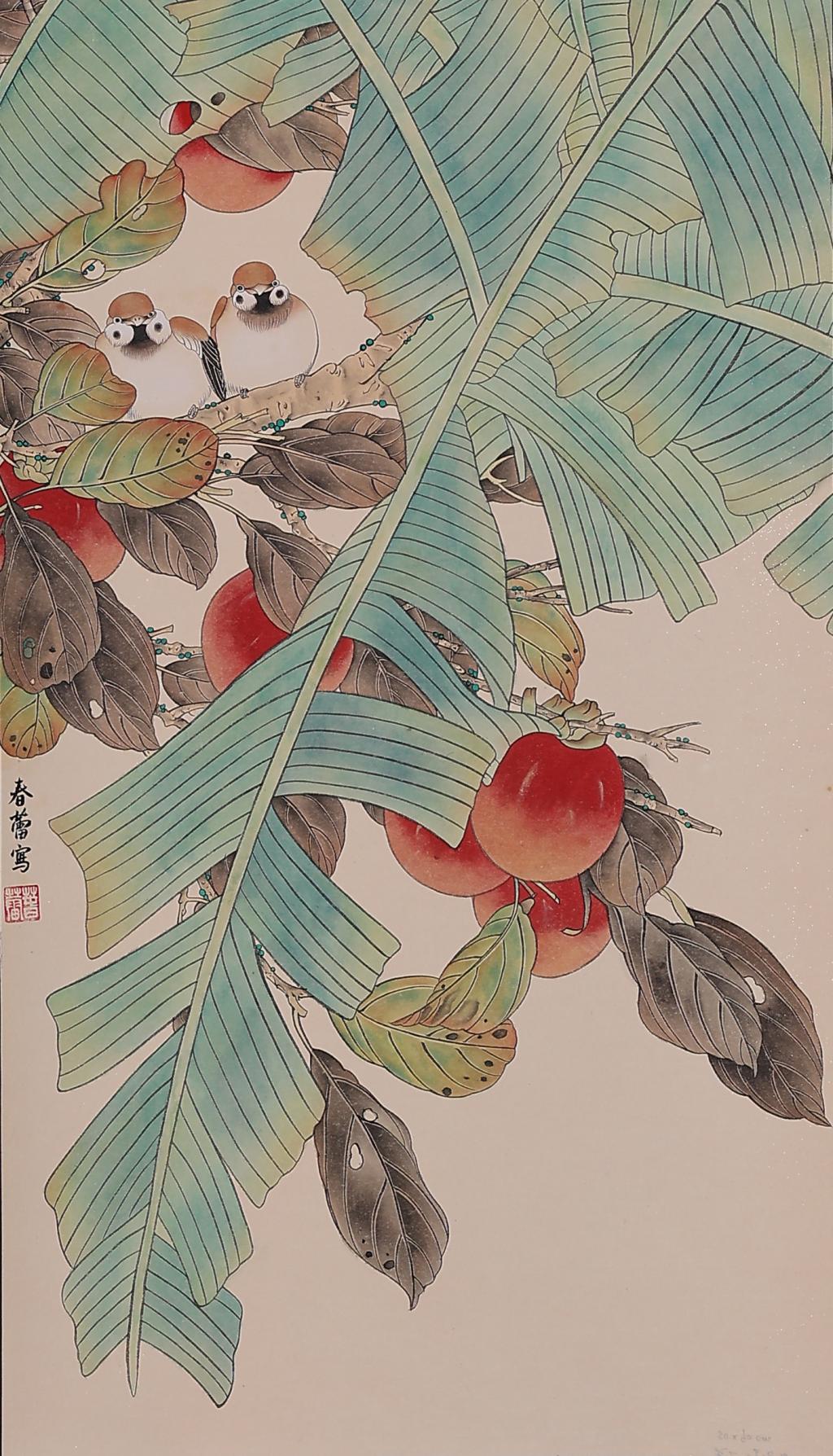
作品名称:秋 | Autumn
作者:李春蕾 Li Chunlei
指导教师:王志勇 Wang Zhiyong
材质:纸本 paper
创作时间:2022 年 4 月 April,2022
尺寸:90×50(cm)
作品分类:中国画 Chinese paintings
创作说明:
作品为工笔花鸟,绘荷花水草从中的两只鹭鸶,一站立休憩,一斜蹲欲飞,荷叶荷花表面平滑且均匀,创作出理想化的外观。
Description:
The work is a exquisite brush flower-and-bird painting, in which there are two herons in the lotus water weed, one standing to rest and one crouching to fly. The surface of lotus leaf and lotus is smooth and uniform, creating an idealized appearance.


作品名称:素心依依 | My modest heart
作者:肖冰 Xiao Bing
指导教师:石以品 Shi Yipin
材质:纸本 paper
创作时间:2022 年 4 月 April,2022
尺寸:138×68(cm)
作品分类:中国画 Chinese paintings
创作说明:
岁月若水,走过,才知深浅;生命如歌,唱响,方品心音。我静守岁月,用淡墨点染心仪的一角,思绪繁衍在笔尖中,心染幽香,情着素锦,淡静若水,静默如花,清清浅浅,静雅一方,不忘来路,始知归处。启发。
Description:
Ages are flowing like water. You understand its depth just by walking through it. Life is a song, I taste its voice by singing it. I was watching the ages quietly and painting a corner of my heart with light ink, having my thoughts gather together in the tip of my brush. My heart is dyed with faint fragrance and covered with plain brocade, as quiet as water, as silent as blossoms, clear and shallow, tranquil and elegant. I know where to go by knowing where I came from.

作品名称:篆书 晏殊 浣溪沙 | Seal script Yan Shu Huan Xi Sha
作者:王婧瑄 Wang Jingxuan
指导教师:王志勇 Wang Zhiyong
材质:纸本 paper
创作时间:2022 年 4 月 April,2022
尺寸:180×49(cm)
作品分类:书法 calligraphy
创作说明:
书法为篆体。书写内容为:一曲新词酒一杯,去年天气旧亭台。夕阳西下几时回?无可奈何花落去,似曾相识燕归来。小园香径独徘徊。
Description:
The calligraphy is in seal script and referred to a poem of Yan Shu who was a famous official and poet in Song dynasty. The poem describes a scenery of beautiful garden in where the poet was drinking alone and missing his old friends.
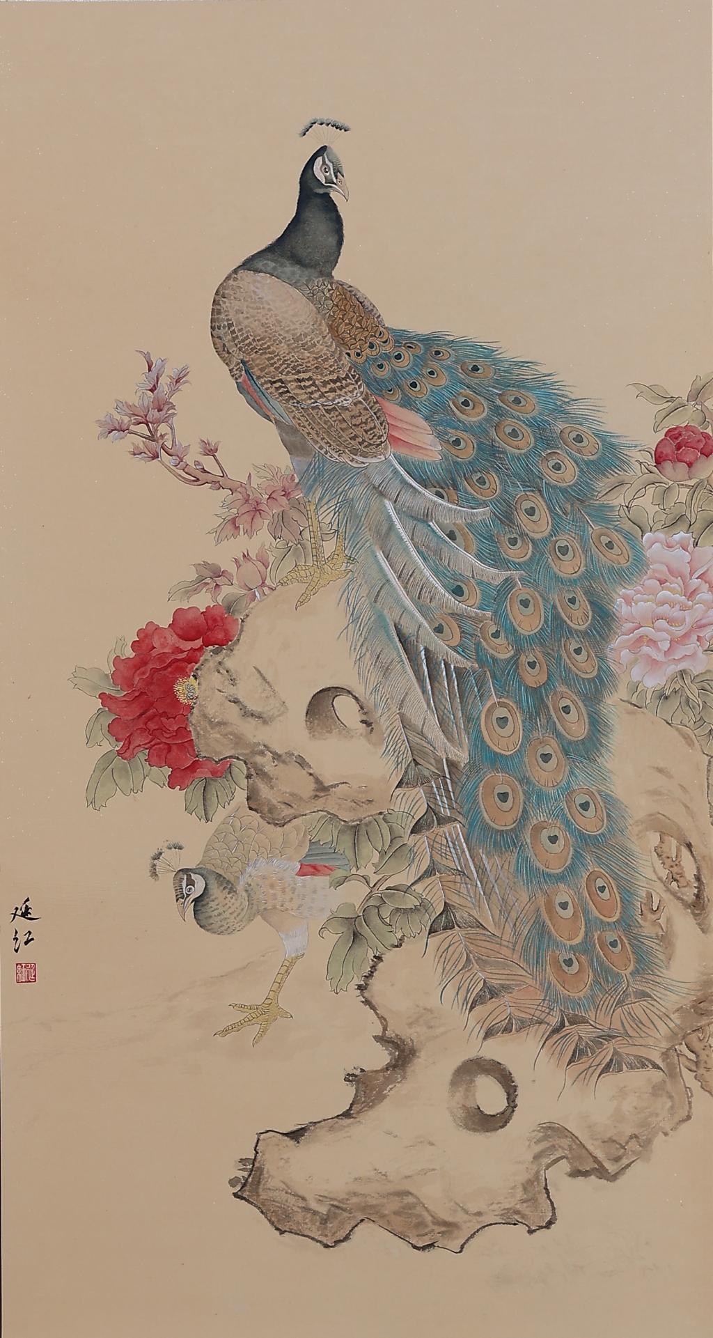
作品名称:红珠斗帐樱桃熟,金尾屏风孔雀闲 | Peacock with screen and cherries
作者:杜延红 Du Yanhong
指导教师:李峰 Li Feng
材质:纸本 paper
创作时间:2022 年 4 月 April,2022
尺寸:100×50(cm)
作品分类:中国画 Chinese paintings
创作说明:
此幅作品是我在写关于刘奎龄先生的论文时,对他的作品进行分析时受到的启发。此幅作品利用空间大小的对比突出孔雀这一主题,又利用植物元素的穿插使得局部富有变化,使整体不会过于单调呆板,使整体看上去更加的具有趣味性。
Description:
This piece of work was inspired by the analysis of Liu Kuiling’s paintings during my thesis writing. This work uses the contrast of space and size to highlight the theme of the peacock, and uses the interspersed plant elements to make the part rich in changes, so that the whole will not be too monotonous and rigid, making the work looks more interesting.

作品名称:再见了青春 | Goodbye Youth
作者:卢俊锡 Lu Junxi
指导教师:宋述林 Song Shulin
材质:纸本 paper
创作时间:2022 年 4 月 April,2022
尺寸:180×48(cm)
作品分类:书法 calligraphy
创作说明:
大字出自颜真卿《多宝塔碑》中的楷书,内容为唐代王维的《送元二使安西》。小字出自智永《行草千字文》中的行书,内容为当代歌手曹轩宾《别君叹》的歌词与本人的题跋。本作品想表达对过往之“友”和“曾经单纯的自己”的送别之情。
Description:
The larger character’s style refers to Tang calligrapher Yan Zhenqing’s regular script work “Inscription of Duobao tower”, and the content comes from "Bidding Farewell to Yuan Er on Diplomatic Mission to Anxi “ which written by Tang poet Wang Wei. The Smaller character’s style refers to Tang calligrapher Zhi Yong’s work, and the content comes from the lyric of “Sigh for seeing you off” which composed by contemporary singer Cao Xuanbin, with my postscript added on. I willing to express an emotion of bidding farewell to my past "friends" and the "ever naive me".
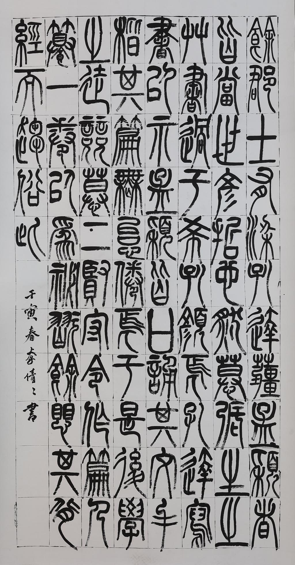
作品名称:《篆书非草书》 | Critique of the cursive script
作者:李倩倩 Li Qianqian
指导教师:高远 Gao Yuan
材质:纸本 paper
创作时间:2022 年 4 月 April,2022
尺寸:178×97(cm)
作品分类:书法 calligraphy
创作说明:
余郡士有梁孔达。姜孟颖,皆当世之彦哲也,然慕张生之草书过于希孔、颜焉。孔达写书以示孟颖,皆口诵其文,手楷其篇,无怠倦焉。于是后学之徒竞慕二贤,中令作局,人撰一卷。以为秘玩。余惧其背经而趋俗
Description:
The calligraphy is in seal script and excerpted from the article "Critique of the cursive script" of Zhao Yi who lived in Han dynasty and was good at writing poems and criticizing contemporary issues.

作品名称:隶书·杜甫闻官军收河南河北 | Recapture of the Regions North and South of the Yellow River
作者:姜冰 Jiang Bing
指导教师:高远 Gao Yuan
材质:纸本 paper
创作时间:2022 年 4 月 April,2022
尺寸:150×70(cm)
作品分类:书法 calligraphy
创作说明:
书法为隶书。书写内容为:剑外忽传收蓟北,初闻涕泪满衣裳。却看妻子愁何在,漫卷诗书喜欲狂。白首放歌须纵酒,青春作伴好还乡。即从巴峡穿巫峡,便下襄阳向洛阳。
Description:
The calligraphy is in chancery script. The translation of this poem as follow:Tis said that the Northern Gate is recaptured of late;When the news reached my ears, my gown was wet with tears.Staring at my wife’s face, of grief I find no trace;Rolling up my verse books, my joy like madness looks.Though I am white-haired, still I’d sing and drink my fill.With verdure spring’s aglow, it’s time we homeward go.We shall sail all the way through Three Gorges in a day.Going down to Xiangyang, we’ll come up to Luoyang.
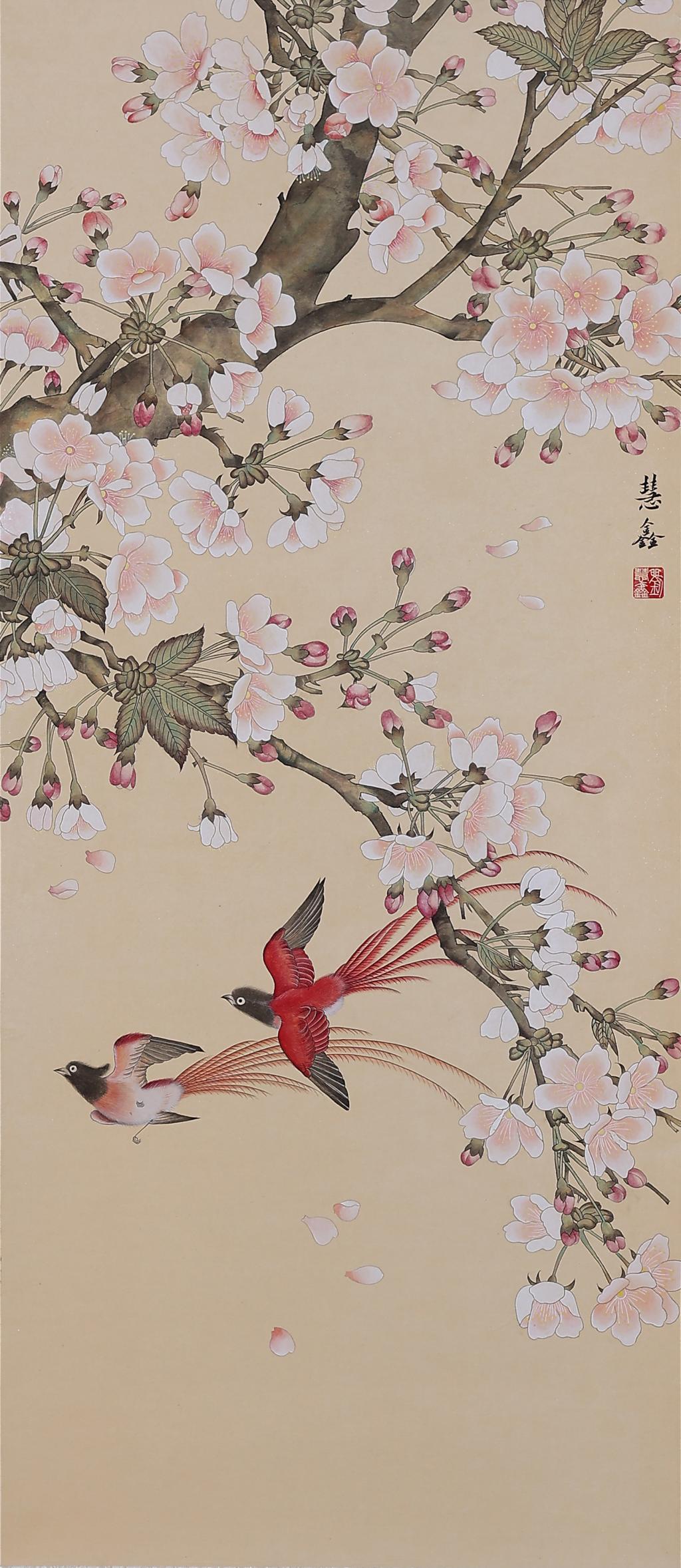
作品名称:春晓图 | Morning In Spring
作者:刘慧鑫 Liu Huixin
指导教师:杨宁 Yang Ning
材质:纸本 paper
创作时间:2022 年 4 月 April,2022
尺寸:132×58(cm)
作品分类:中国画 Chinese paintings
创作说明:
此幅作品为工笔花鸟画,描绘的是春天早晨双鹊飞舞在樱花树枝中春意盎然的景色,展现出春日万物的生机勃勃,感受春天的到来,令人如沐春风。春无踪迹谁知?除非问取黄鹂。百啭无人能解,因风飞过蔷薇。
Description:
This work is a flowers and birds painting in realistic style, depicting a spring scene of two magpies flying in the branches of a cherry tree in a spring morning, showing the vitality of everything in spring and soft spring breeze.
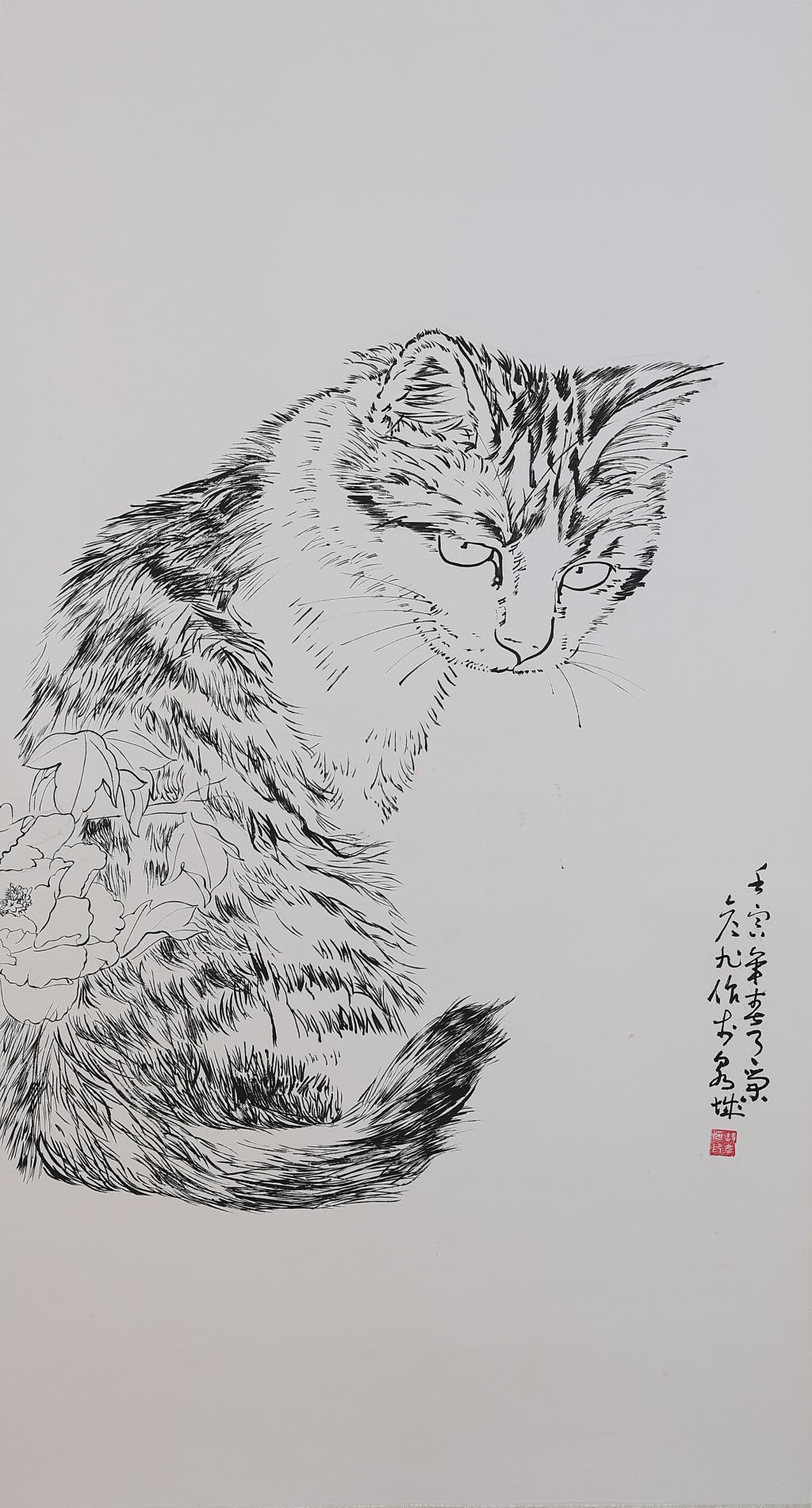
作品名称:一只猫 | A Cat
作者:荣彦旭 Rong Yanxu
指导教师:石以品 Shi Yipin
材质:纸本 paper
创作时间:2022 年 4 月 April,2022
尺寸:180×95(cm)
作品分类:中国画 Chinese paintings
创作说明:
此画构图为 C构图,画法白描,画中的猫神情落寞,心情复杂,眼睛的低沉表现出猫咪身上散发的忧伤。
Description:
The composition of this painting is in a C shape, and I used lines to draw it. The cat in the painting looks lonely and in a complicated mood, as if there is sadness in the cat’s eyes.
视/觉/传/达/设/计

作品名称:大学生社交恐惧症人群心理情绪插画设计研究 | Psychological Emotion Illustration Design Of College Students With Social Phobia
作者:王岩炎 Wang Yanyan
指导教师:范奉存 Fan Fengcun
媒材:亚克力 Acrylic Vacuum Plastic Bags, etc
创作时间:2022年 3 月 12 日 March 12,2022
尺寸:26×26(cm)
研究领域:社交恐惧症系列插画 Social Phobia Illustrations
创作说明:
此设计主要对大学生社交恐惧症人群心理情绪插画进行了研究,通过插画的形式把 大学生社交恐惧症人群心理情绪表现出来,画面整体色调偏向于冷色调,以此利用色彩 的负面效应来烘托画面的主题思想 ; 构图采用的有利于受众接受的平行或环形构图 ; 内容偏向于有故事情节性的,可以让受众更容易了解笔者的想法以及理解画面内涵。并由此对大学生社交恐惧症治愈插画的进行了设计,治愈插画的内容是温暖舒缓的意境,有利于引导大学生积极正向的心理情绪,题材选用大自然的以及具有亲和力的形象。最后,根据此设计衍生出一系列有关文创产品。
Description:
This design mainly studies the psychological emotion of college students' social phobia group illustration, through the form of illustration to show the psychological emotion of college students' social phobia group, the overall color of the picture tends to be cold color, in order to use the negative effect of color to foil the theme of the picture; A parallel or circular composition that is acceptable to the audience; The content tends to have a story plot, which can make it easier for the audience to understand the author's ideas and understand the connotation of the picture. The content of the healing illustration is warm and soothing, which is conducive to guiding the positive psychological emotions of college students. The theme is nature and the image with affinity. Finally, a series of cultural and creative products are derived from this design.
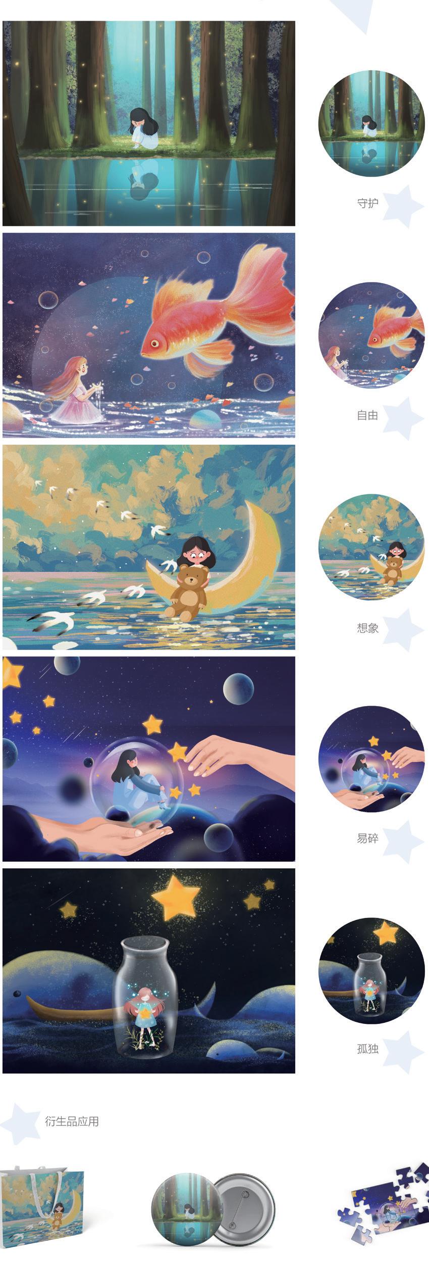
作品名称:关爱自闭症儿童的插画设计研究—以星星之名 | Study On The Illustration Design Of Caring For Autistic Children— In The Name Of The Stars
作者:焦世媛 Jiao Shiyuan
指导教师:江伊诺 Jiang Yinuo
材质:亚克力 Acrylic
创作时间:2022 年 3 月 12 日 March 12,2022
尺寸:30×21(cm)
研究领域:插画设计 Illustration Design
创意说明:
此设计通过插画的形式来表达对自闭症儿童的关爱。此设计结合画面运用了几种不同的肌理来表现,与扁平化的插画设计表现手法相结合,使画面丰富具有层次感。画面中整体色调明亮,从而使整体画面积极向上。结合自闭症儿童的特征,选出几样具有代表性的元素,运用到画面当中去。不同元素的相互结合运用,来表达自闭症儿童的内心世界。希望让社会更多人关注了解自闭症儿童,给与他们关爱与保护。
Description:
This design expresses care for autistic children through illustration. This design combines the screen with the use of several different textures to show, and flat illustration design expression techniques combined, so that the screen rich with a sense of hierarchy. The overall tone in the picture is bright, so that the overall picture is positive. Combined with the characteristics of autistic children, select several representative elements and apply them to the picture. Different elements are combined to express the inner world of autistic children. I hope that more people in the society will pay attention to understand autistic children and give them care and protection.
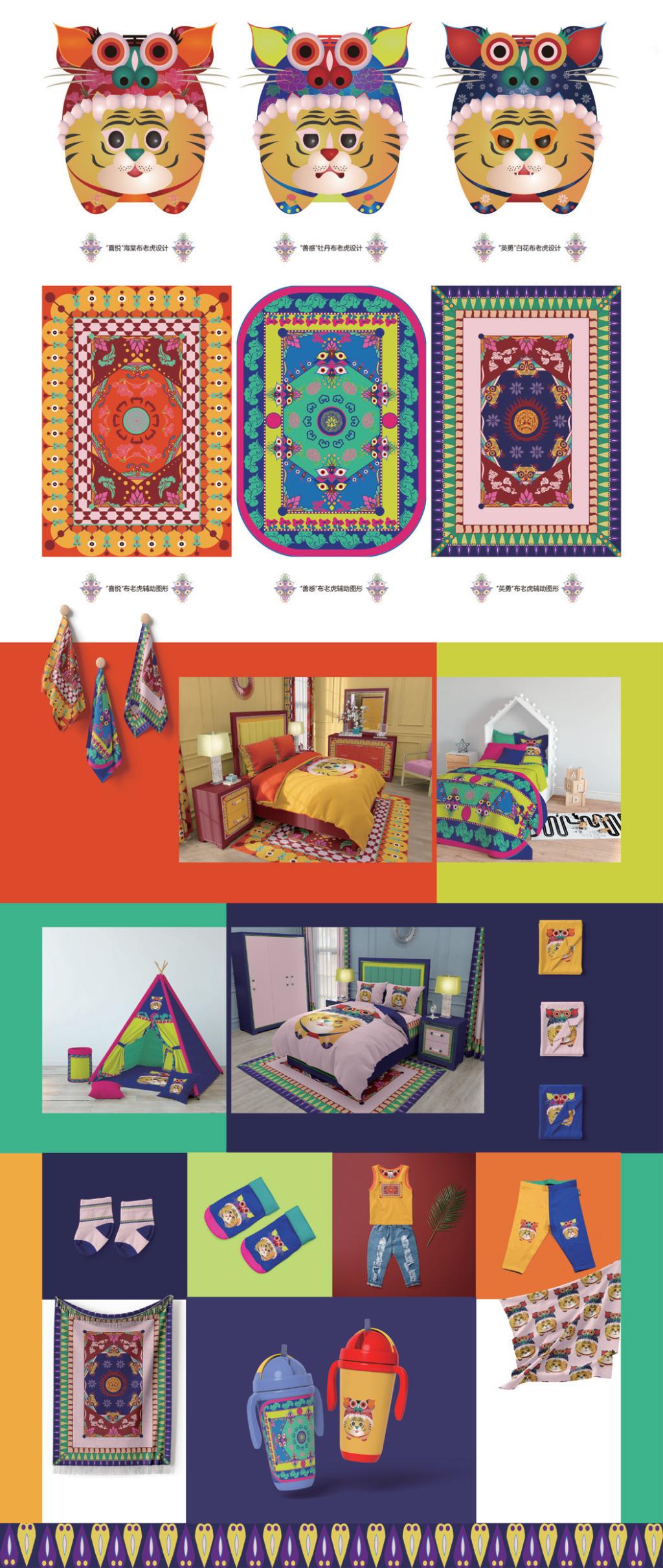
作品名称:沂蒙布老虎形态创新设计研究 | Yimeng Cloth Tiger Shape Innovation Design
作者:胡超群 Hu Chaoqun
指导教师:崔敬 Cui Jing
材质:棉质面料 Cotton fabrics
创作时间:2022 年 3 月 12 日 March 12,2022
尺寸:23.06×17.71(cm)
研究领域:IP 文创设计 IP Cultural Design
创作说明:
传统民间手工艺经过历史长河沉淀,带有浓烈的地方特色及鲜明的文化寓意,在此基础上,造型设计、色彩搭配、制作工艺等艺术手法也是相当可圈可点。此设计以沂蒙地区传统手工艺布老虎的文化背景和造型风格作为基础,提取元素、整合归纳,进行形态再创新。选取沂蒙布老虎最为象征性的三个形象为代表,在原有的造型基础上,迎合现代审美潮流,保留其憨态可掬,大胆夸张的特征,将其无固定规则的搭配体系化,增强其代表性和识别度,并结合其中色彩与图形设计出辅助图形作方便衍生产品应用,扩展传统布老虎的设计应用,形成着重于家装品牌的主要服务于儿童及青少年的具有时代特征和沂蒙民间特色的全新形象。不仅对沂蒙布老虎的研究提供实践经验,更是对于中华传统民间文化的继承和创新,使其成为新潮流。
Description:
Traditional folk handicrafts have been precipitated through the long history, with strong local characteristics and distinct cultural implications. On this basis, the artistic techniques such as shape design, color collocation and production technology are also quite noteworthy. Based on the cultural background and modeling style of traditional handicraft cloth tiger in Yimeng area, this design extracts elements, integrates and summarizes, and innovates the form again. Selection of river bank Mongolia cloth tiger represented the most symbolic image of three, on the basis of the original shape, cater to the modern aesthetic trend, could retain its innocently, boldly exaggerated features, it has no fixed rules the collocation of systematism, enhance its representative and recognition, and combining the color and graphics design auxiliary graphics as a convenient derivatives application, Extend the design and application of traditional cloth tiger, and form a new image with age characteristics and folk characteristics of Yimeng, which focuses on home decoration brand and serves children and teenagers. It not only provides practical experience for the study of yimeng cloth tiger, but also inherits andinnovates the traditional Chinese folk culture, making it a new trend.
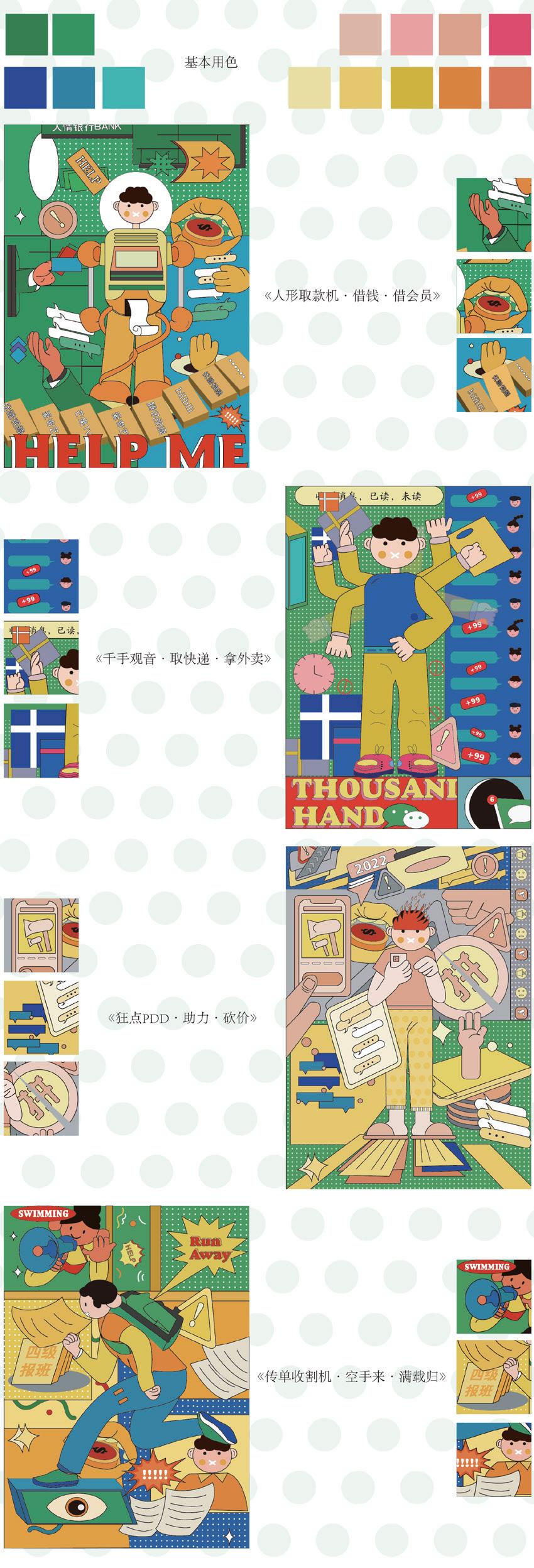
作品名称:羞于拒绝 | Too Shy To Say No
作者:朱笑文 Zhu Xiaowen
指导教师:江伊诺 Jiang Yinuo
材质:胶版印刷 Offset Printing
创作时间:2022 年 3 月 22 日 March 22,2022
尺寸:42×29.7(cm)
研究领域:插画设计 Illustration Design
创意说明:
本作品以 " 羞于拒绝”为主题绘制插画,插画的构想来源于生活,在生活中我们有很多不好意思去拒绝的事情,以生活中的小事为出发点,构思每一幅画面的主题,作品中主人公被胶带封住了嘴巴,难以拒绝别人的请求。本作品致力通过设计来帮助人们缓解心理问题,调节生活压抑等因素弓起的消极情绪,使人们形成有利于心理健康的积极情绪,从而勇敢做自己。
Description:
This work draws illustrations with the theme of "Ashamed to refuse". The idea of illustration comes from life. In life, we have a lot of things that we are too embarrassed to refuse. This work is committed to help people relieve psychological problems through design, adjust the negative emotions caused by life depression and other factors, so that people form positive emotions conducive to mental health, so as to be brave to be themselves.
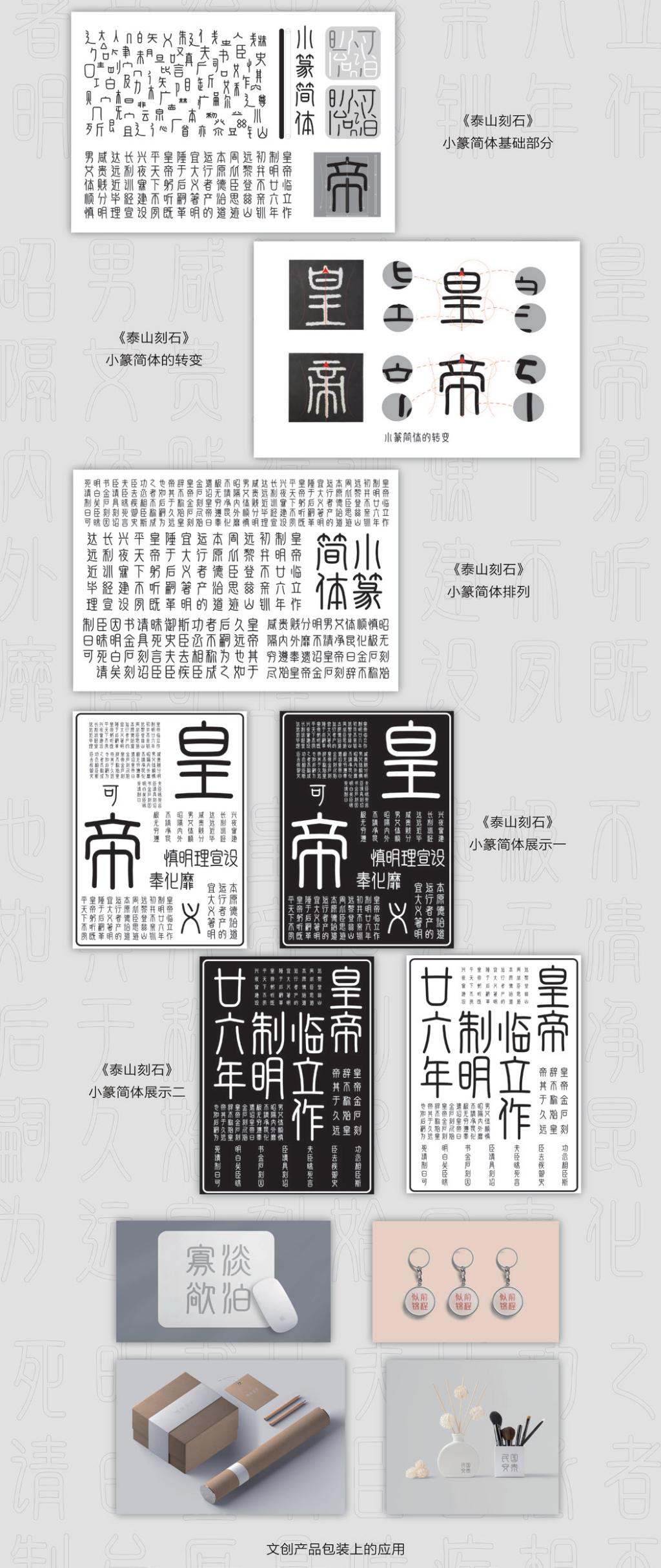
作品名称:泰山时刻字体再设计 | "Tarzan Carved Stone" Font Redesign
作者:窦桂山 Dou Guishan
指导教师:范奉存 Fan Fengcun
材质:胶版印刷 Offset Printing
创作时间:2022 年 4 月 25 日 April 25,2022
尺寸:42×29.7(cm)
研究领域:字体设计 Font design
创意说明:
此设计由《泰山刻石》小篆字体演变而来,我将《泰山刻石》当中的小篆字体与现代的简体结合设计出小篆简体,用现代的字体设计寻求传统文化与创新的契合点,小篆简体的形体以及线条感符合《泰山刻石》小篆字体的形体和线条感,在结构、审美以及阅读性上又符合了现代字体的特点,这样的设计更易于让《泰山刻石》小篆字体文化在现代社会中传播。在现代社会中小篆简体更加实用和美观,小篆简体可以运用在文创包装等方面以达到产品宣传、地域宣传、文化宣传的目的。
Description:
This design by the Mountain Tai burring seal script font evolved, I will seal script font of the Mountain Tai burring combined with modern simplified design simplified, modern font design is used to seek the correspondency of traditional culture and innovation, seal script simplified form and line feeling and conforms to the Mountain Tai burring seal script font form line feeling, In terms of structure, aesthetics and readability, it is in line with the characteristics of modern fonts. Such a design is easier to make the small seal script culture of "Stone Carving in Mountain Tai" spread in modern society. In modern society, small seal style simplified is more practical and beautiful. Small seal style simplified can be used in cultural and creative packaging to achieve the purpose of product publicity, regional publicity and cultural publicity.
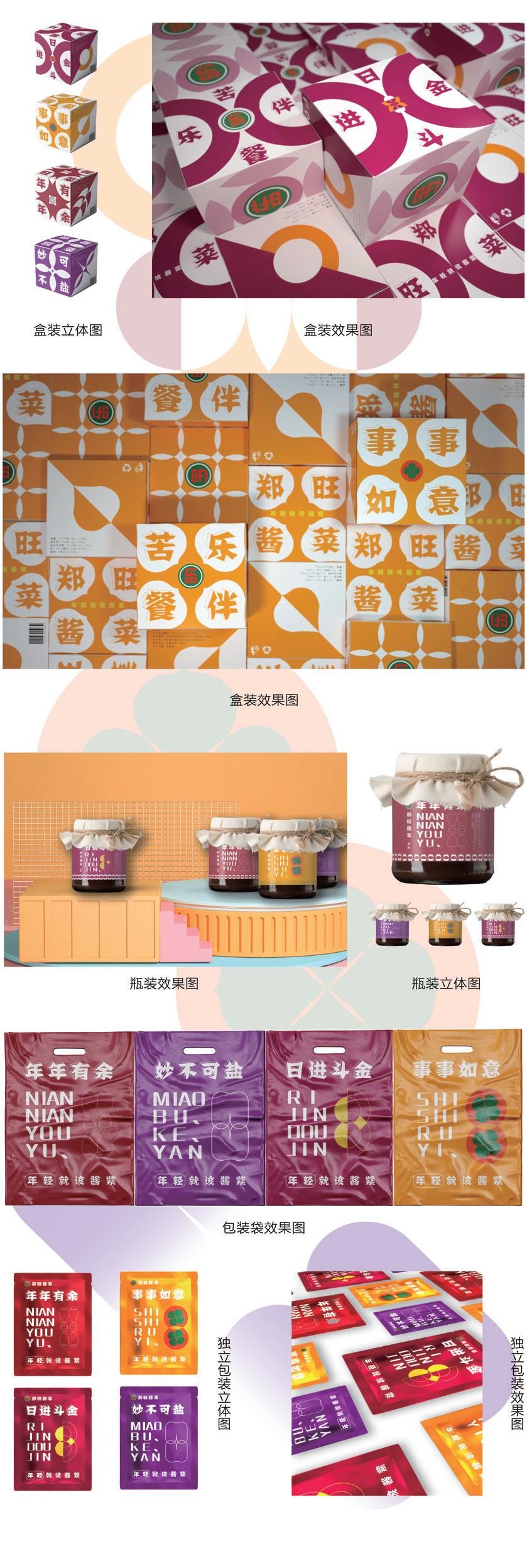
作品名称:新时代郑旺酱菜包装个性化创新设计与应用 | Zheng Wang Pickles Packaging Personalized Innovative Design
作者:刘永昌 Liu Yongchang
指导教师:马洪骥 Ma Hongji
材质:胶版印刷 Offset Printing
创作时间:2022 年 3 月 24 日 March 24,2022
尺寸:10×10×10(cm)
研究领域:包装设计 Packaging Design
创意说明:
在上个世纪郑旺酱菜就已然被评为亚运会的指定产品,并屡次获得食品博览会的各种奖项,其作为非物质文化遗产亟需创新发展与传承,此设计根据郑旺酱菜产品实际意义与传统寓意为基本出发点,目标用户定位于年轻群体,打造苦乐餐伴的新营销理念,以此创新品牌形象提升企业影响力。创新设计结合当地风俗文化、新时代流行语,如“柿柿如意、日进斗金、年年有鱼”等立足点进行延申,与此同时进行特色定位的挖掘,打造“妙不可盐”等差异化、个性化产品。另外根据疫情常态化的社会背景下,创新其包装形式,降低了交叉食用频率,打造为新时代下年轻、个性、实用的特色产品。
Description:
Zheng Wang pickles in the last century has been rated as the designated products of the Asian games, and repeated food exposition of the various awards, as an intangible cultural heritage in need of inheritance, innovation and development this design Zheng Wang pickles products based on the actual meaning and moral tradition as the basic starting point, the target user positioning in young group, going to build one meal with new marketing concept, In order to innovate the brand image to enhance the influence of enterprises. Innovative design combined with local customs and culture, new era catchwords. At the same time, the excavation of characteristic positioning, to create "wonderful but not salt" and other differentiated, personalized products. In addition, according to the social background of the epidemic normalization, innovative packaging forms, reduce the frequency of crossconsumption, to create a young, personalized and practical products in the new era.
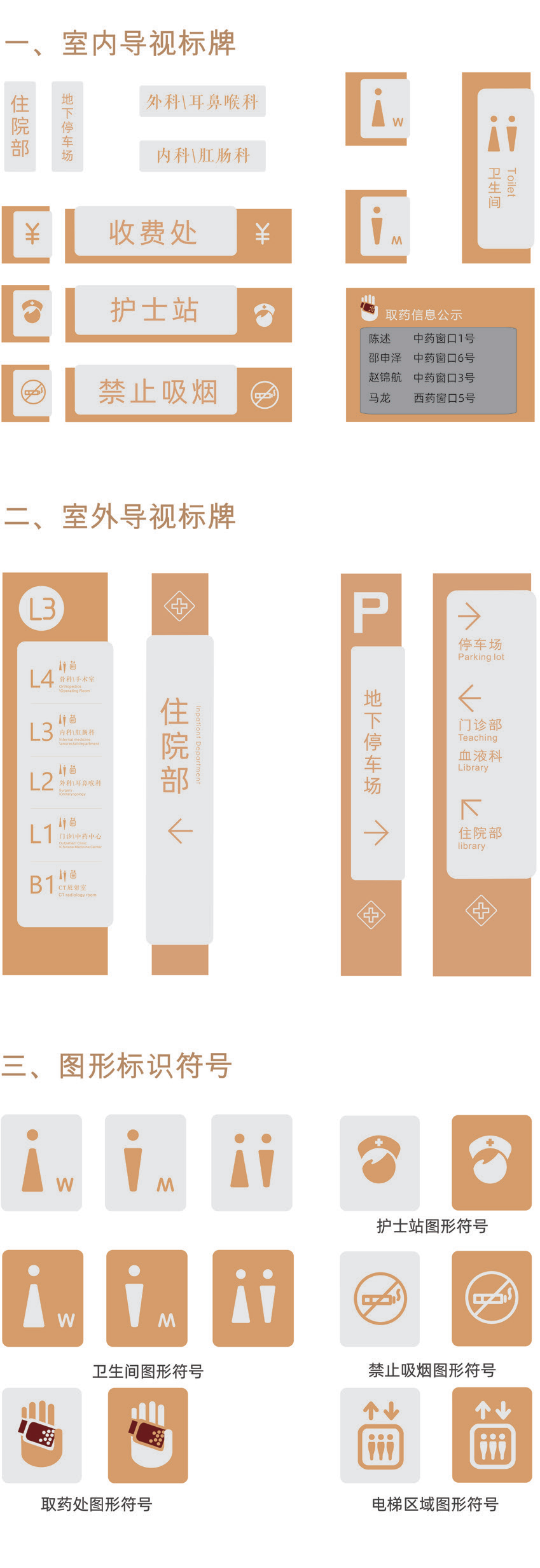
作品名称:山东省中医院视觉导视系统设计 | Design Of Visual Guidance System For Shandong Traditional Chinese Medicine Hospital
作者:陈申奥 Chen Shenao
指导教师:范奉存 Fan Fengcun
材质:亚克力 棉质面料 原木 Acrylic, Dotton, Fabric Log
创作时间:2022 年 4 月 10 日 April 10,2022
尺寸:240×80(cm)
研究领域:导视系统设计 Guide System Design
创意说明:
通过对山东省中医院现有视觉导视系统的观察研究,发现一系列与国内大部分医院类似的设计问题,本文就我国复杂医疗设计环境出发,旨在为山东省中医院设计出方便大众、富有关怀的导视系统,以通过关注医患人群人文需求的导视系统设计,让大众在医院中可以更加便捷地寻找医疗部门的同时感受医院的人文关怀,并进一步提高社会关注度,逐步改善大众对医院冰冷、环境复杂的印象。
Description:
Based hospital in Shandong province, the existing visual guide depending on the system study, found a series of similar design problem to most of domestic hospitals, this article on China's complicated medical environment, the design, aiming at Shandong province hospital designed a convenient mass, rich, caring guide system, in order to pass the focus on doctor-patient crowd humanities demand guide as system design, So that the public can find the medical department in the hospital more conveniently and feel the humanistic care of the hospital, and further enhance the social attention, and gradually improve the public's impression of the cold and complex environment of the hospital.
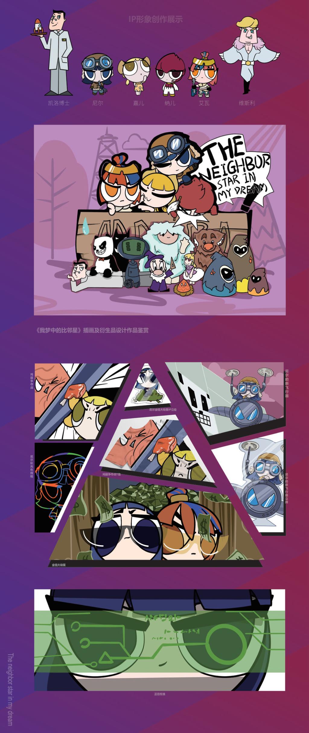
作品名称:《我梦中的比邻星》插画及衍生品设计 | The Illustration And Derivative Design Of Proxima Centauri In My Dreams
作者:宋金峰 Song Jinfeng
指导教师:吴春华 Wu Chunhua
材质:亚克力板 树脂等 Acrylic Board, Resin, etc
创作时间:2022 年 3 月 12 日 March 12,2022
尺寸:52.6×39.4(cm)
研究领域:IP插画设计 IP Illustration Design
创作说明:
对于人物形象本身多余的,繁杂的装饰,通通去掉,保持简洁的自身有利于人物后期更加多方向的创造,正如密斯凡德罗的主张那样,"Less is more",贯彻始终。艺术的来源是什么,怎样的艺术又算是好的艺术呢 ? 作品运用了插画,既突出作品人物形象的性格以及外貌特点,将一个个碎片整合起来, 形成一套较为完整的组合体系。设计作品来源于现实又高于现实。动画卡通形象典型化的人物可以很好的突出这一特点。
Description:
For the redundant and complex decoration of the character image itself, all should be removed, and keeping simple is conducive to the creation of the character in more directions in the later period. Just as Mies van der Rohe advocated, "Less is more" should be implemented all the time. What are the sources of art and what is good art? The work uses illustration, which not only highlights the personality and appearance characteristics of the characters in the work, but also integrates the pieces to form a relatively complete combination system. Design works come from reality and higher than reality. Typical characters of cartoon images can well highlight this feature.
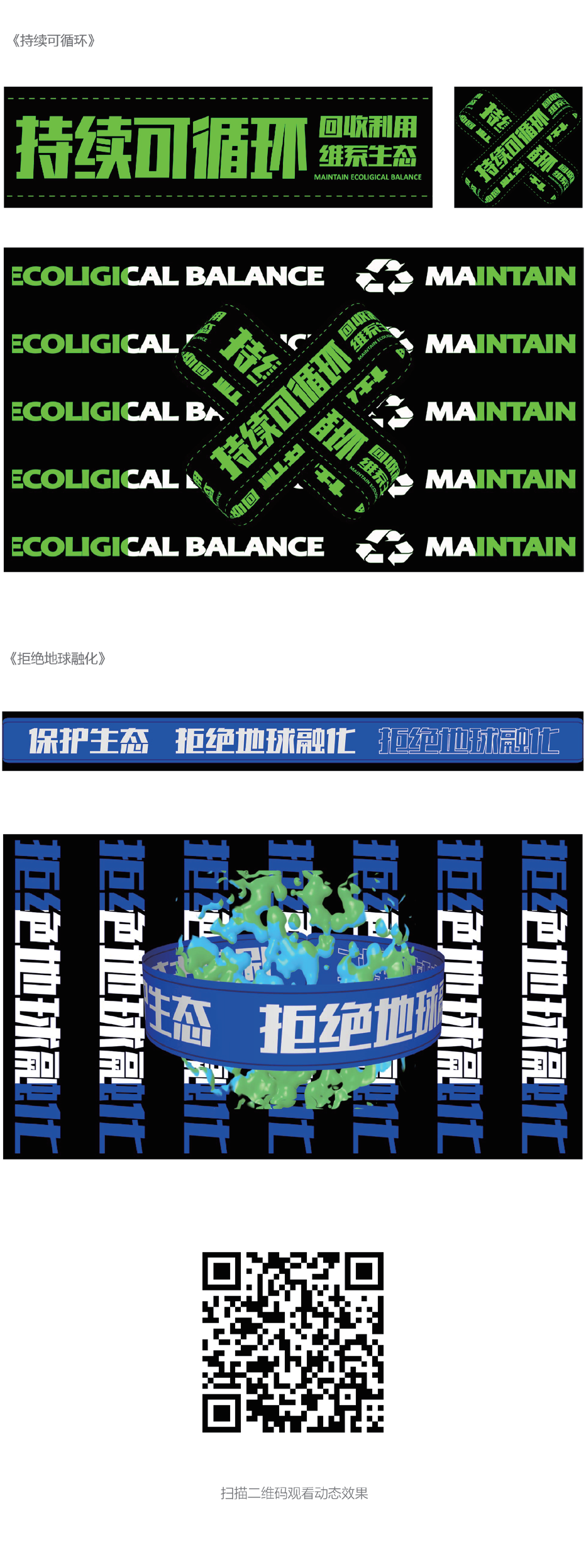
作品名称:动态环保海报设计 | Dynamic Environmental Poster Design
作者:张梦琦 Zhang Mengqi
指导教师:崔敬 Cui Jing
媒材:亚克力 Acrylic
创作时间:2022年 3 月 25 日 March 25,2022
尺寸:16×9(cm)
研究领域:环保动态设计 Environmental Dynamic Design
创作说明:
基于环保的动态设计从引导当代年轻人的正确环保观念出发,通过环保视觉设计向年轻群体传达环保理念,拉近年轻人与环保的距离,唤起年轻群体保护环境的责任感。
Description:
Dynamic design based on environmental protection starts from guiding the correct concept of environmental protection of contemporary young people, through environmental visual design to convey the concept of environmental protection to young groups, shorten the distance between young people and environmental protection, arouse the responsibility of young groups to protect the environment.
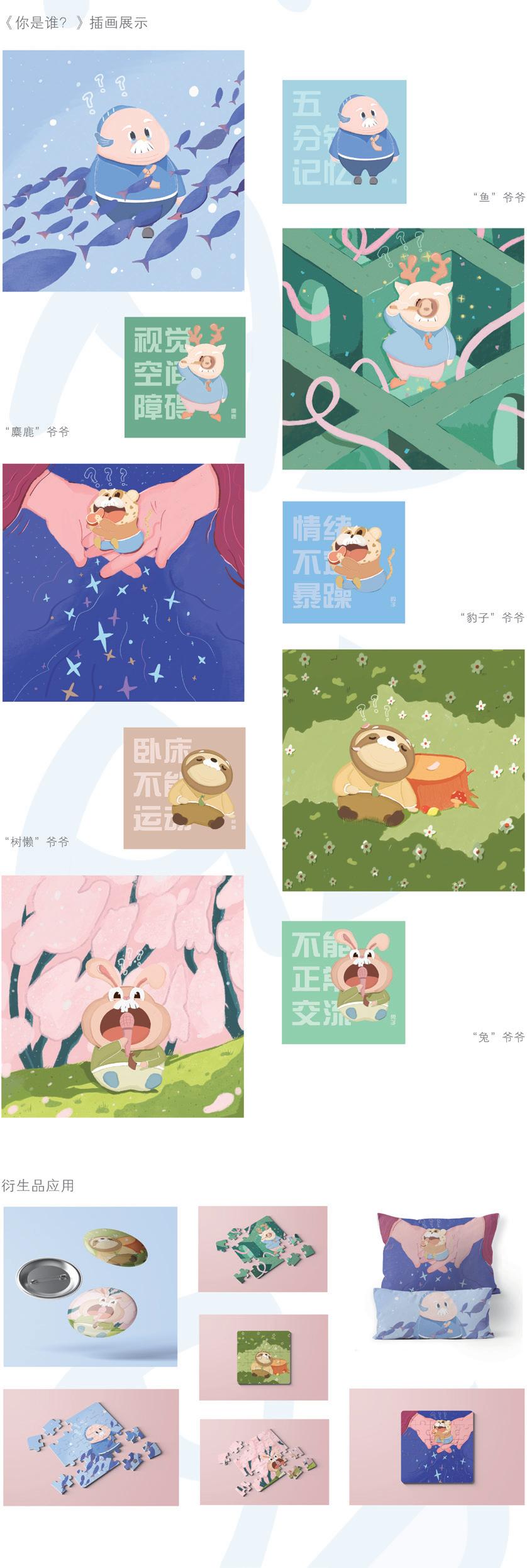
作品名称:你是谁?插画设计 | Who Are You?
作者:张海冉 Zhang Hairan
指导教师:江伊诺 Jiang Yinuo
材质:亚克力 铜纸板 Acrylic, Doated Paper
创作时间:2022 年 4 月 19 日 April 19,2022
尺寸:40×40(cm)
研究领域:插画设计 Illustration Design
创作说明:
该插画是在基于关怀阿尔兹海默症人群的主题下,选取了与该病症人群的心理和行为特点相接近的动物形象来创作的,以拟人的圆润饱满的动物造型,加之童趣治愈的绘画设计风格来展现此插画对于阿尔兹海默症人群的关怀与治愈。
Description:
The illustration is based on the theme of the alzheimer's care people, chosen and the psychological and behavior characteristics of the disease population close to create the animal image, in the personification of its full, combined with the tong qu cure painting design style to show the illustration for alzheimer's care and cure by the crowd.

作品名称:中国风口罩 | Chinese-style Masks
作者:曹广超 Cao Guangchao
指导教师:江伊诺 Jiang Yinuo
材质:纳米级熔喷布 纯棉 纳米级回弹棉布 蚕丝 双面弹性针织布 Nano-level Melt-blown Cloth, Pure Cotton , Nano-level Rebound Cotton Cloth, Silk, Double-sided Elastic Knitted Cloth, etc
创作时间:2022 年 3 月 16 日 March 16,2022
尺寸:22×12(cm)
研究领域:口罩设计 Mask Design
创意说明:
对中国风元素在口罩设计中,通过对中国传统纹样、京剧戏曲元素、民族元素、梅兰竹菊元素、宫廷元素,从不同的结构、材质、画面方向,色彩和物体归纳 总结出口罩款式的设计元素的特点。接着对以上的研究进行中国风口罩设计元素提炼,分析出口罩设计中的色彩和图像进行创新。加入中国风的口罩相较于传统的口罩迎合了年轻市场更具优势。
Description:
In mask design, the characteristics of mask design elements are summarized from different structures, materials, picture directions, colors and objects through traditional Chinese patterns, elements of Peking Opera, ethnic elements, elements of plum, orchid, bamboo and chrysanthemum, and palace elements. Then, the above research is carried out to extract the design elements of Chinese-style masks and analyze the colors and images in mask design for innovation. Masks incorporating the Chinese style have an advantage over traditional masks catering to the younger market.
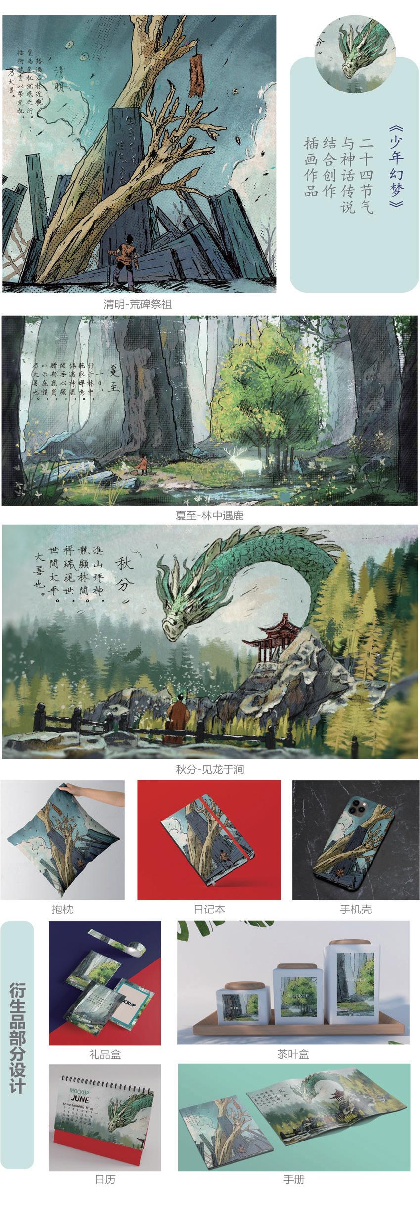
作品名称:《空梦》插画设计 | An Empty Dream
作者:刘运凯 Liu Yunkai
指导教师:范奉存 Fan Fengcun
材质:胶版印刷 Offset Printing
创作时间:2022 年 3 月 24 日 March 24,2022
尺寸:64×30(cm)
研究领域:插画设计 Illustration Design
创意说明:
《空梦》采用中国神话故事与二十四节气为创作灵感,通过对中国神话故事和二十四节气整理分析,归纳总结出其中可以相互融合的元素,再经以故事编写,最终形成的插画作品。通过对其在插画设计起到作用的分析 , 探寻出这些元素与我们今天的插画风格的某种契合点 , 使达到了更加深层次上的融合创造。扎根于中国传统文化,结合现代插画技法。使其更符合现代审美,更好的宣扬中国传统文化。
Description:
"Empty Dream" uses Chinese myth stories and the 24 solar terms as the creation inspiration. Through sorting and analysis of Chinese myth stories and the 24 solar terms, it summarizes the elements that can be integrated with each other, and then it is written with stories and finally forms an illustration work. Through the analysis of its role in the design of illustration, we find out some point of convergence between these elements and our illustration style today, so as to achieve a deeper integration of creation. Rooted in traditional Chinese culture, combined with modern illustration techniques. Make it more in line with modern aesthetics, better promoteChinese traditional culture.
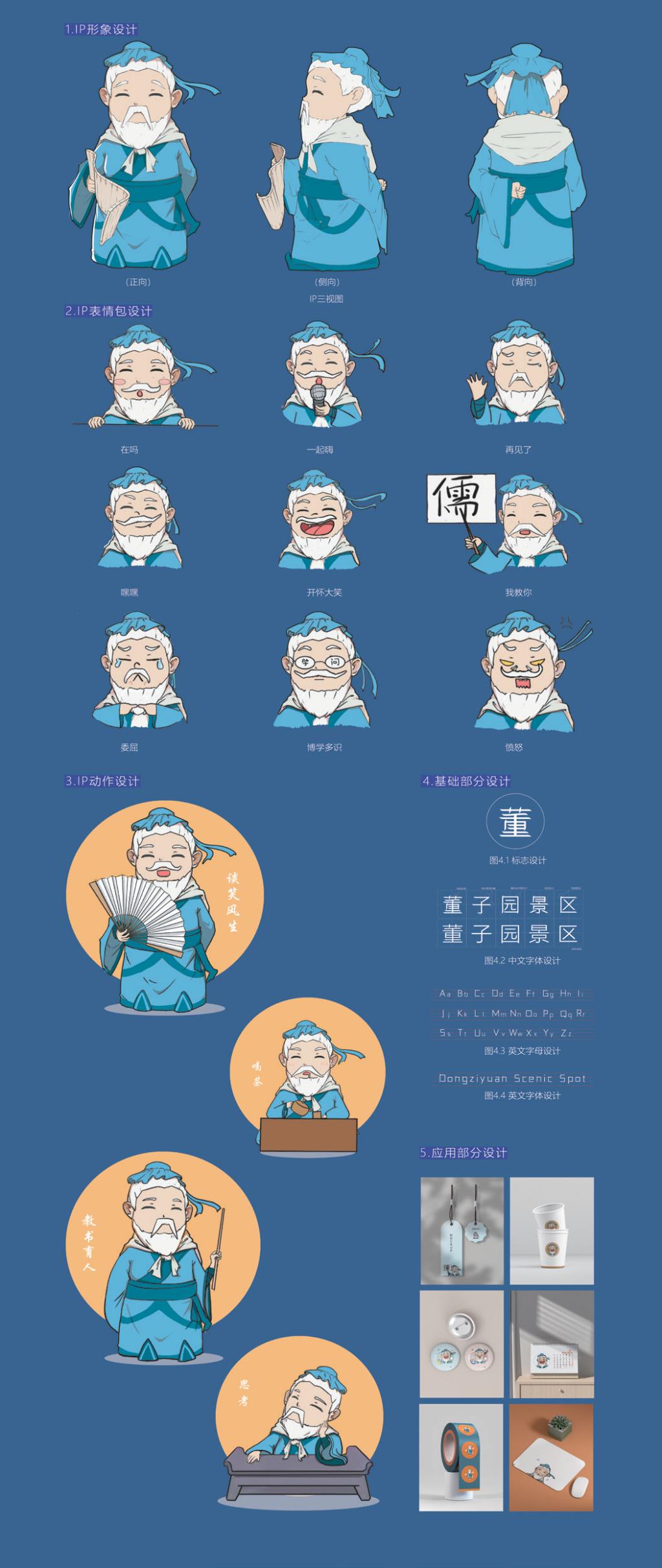
作品名称:董仲舒IP形象及系列设计 | Dong Zhongshu IP Image Design
作者:王世琦 Wang Shiqi
指导教师:吴春华 Wu Chunhua
媒材:棉质面料 Cotton Fabrics Creation
创作时间:2022年 3 月 20 日 March 20, 2022
尺寸:82×55(cm)
研究领域:IP文旅设计 Cultural Tourism IP Design
创作说明:
整体设计贯穿文人设计理念,作为一代大儒,人物形象沉稳大气,具有儒雅的特点基于此IP形象采用蓝色为主色调,面部选用肉色贴合实际。头中设计意为凸显文人形象,面部萌化、卡通画处理更能拉进游客尤其是青少年的距离,消解晦涩的传统文化带来的阻力和距离感。衣服设计选用汉服,手中握着竹简,更加符合儒家的文学气息。
Description:
The overall design runs through the design concept of literati. As a great scholar of the generation, the figure image is calm and atmospheric, with the characteristics of elegance. Based on this IP image, blue is the main color, and the face is flesh color, which fits the reality. The design of the scarf is intended to highlight the image of literati. The cute face and cartoon processing can draw tourists, especially teenagers, into the distance, and eliminate the resistance and sense of distance caused by obscure traditional culture. The design of the clothes is Han Chinese Clothing, with bamboo slips in hand, which is more in line with the literary atmosphere of Confucianism.
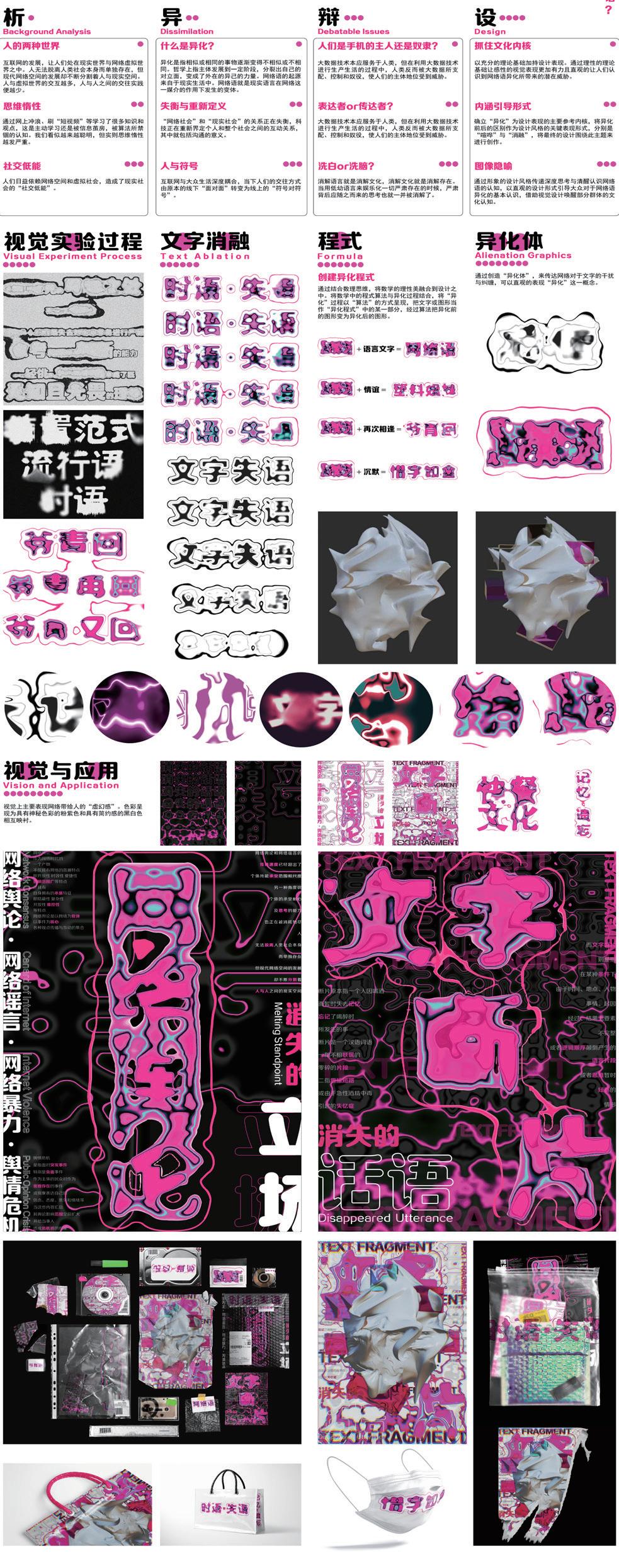
作品名称:时语·失语 | Fade Away Utterance
作者:司佩祺 Si Peiqi
指导教师:蓝天娇 Lan Tianjiao
媒材:亚克力 胶版印刷 丝网印刷 Acrylic, Offset Printing ,Screen Printing
创作时间:2022 年 3 月 12 日 March 12, 2022
尺寸:80×60(cm)
研究领域:综合设计 Integrated Design
创作说明:
互联网发展,让人们处在现实世界与网络虚拟世界之中。网络与现实生活的深度耦合,使人们的交往方式由原本的线下“面对面”转变为线上“符号对符号”。但同时网络与现实的关系正在失衡,科技正在重新界定个人和整个社会之间的互动关系,其中就包括沟通的意义。本设计以网络语“异化”所引发的“文字失语”为背景,通过视觉实验的方式对其知识的逻辑性进行梳理,其演变过程的视觉表现性进行尝试,从而得出其信息可视化的知识逻辑与视觉表现的最优解。
Description:
With the development of the Internet, people live in the real world and the virtual world. The deep coupling between the Internet and real life has transformed people's way of communication from offline "face to face" to online "symbol to symbol". But at the same time, the relationship between the Internet and reality is unbalanced, and technology is redefining the interaction between individuals and the whole society, including the meaning of communication. This design takes the "text aphasia" caused by the "alienation" of network language as the background. Through the way of visual experiment, the logicality of its knowledge is sorted out, and the visual representation of its evolution process is tried, so as to obtain the optimal solution of the knowledge logic and visual representation of its information visualization.
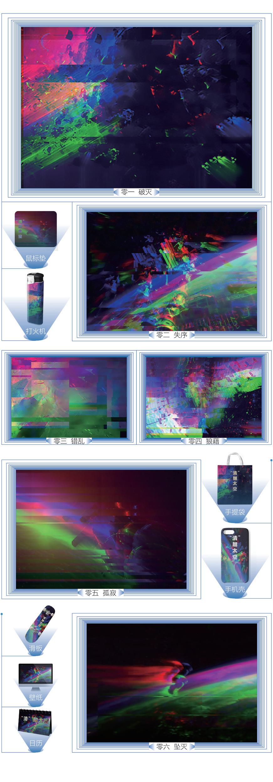
作品名称:“清”朗太空 | "Clear" space
作者:杨庆升 Yang Qingsheng
指导教师:江伊诺 Jiang Yinuo
媒材:胶版印刷 Offset Printing
创作时间:2022年 3 月 20 日 March 20,2022
尺寸:56×40(cm)
研究领域:插画设计 Illustration
创作说明:
《“清”朗太空》系列插画描述的内容为太空垃圾的状态。通过对比强烈色彩的碰撞、表现速度的线条等。以赛博朋克的艺术风格来表现太空垃圾。太空垃圾还有破碎,杂乱等特点。所以还结合了抽象和故障艺术的手法来处理画面。色彩以红蓝绿三色为主,将它们进行重合叠加错位使画面呈现一种凌乱而有序的矛盾美。《“清”朗太空》系列插画创作的目的是希望人们多一些对太空环境的关注与了解。
Description:
"Clear" Space series of illustrations describes the state of space junk. Through the contrast of strong color collision, express the speed of the line and so on. Space junk in the cyberpunk art style. Space junk is also broken, messy and other characteristics. Therefore, it also combines abstract and fault art techniques to deal with the picture. The colors are mainly red, blue and green. Superposition and dislocation of them make the picture show a messy and orderly contradiction beauty. The purpose of "Clear" Space series of illustrations is to hope people to pay more attention to and understand the space environment.
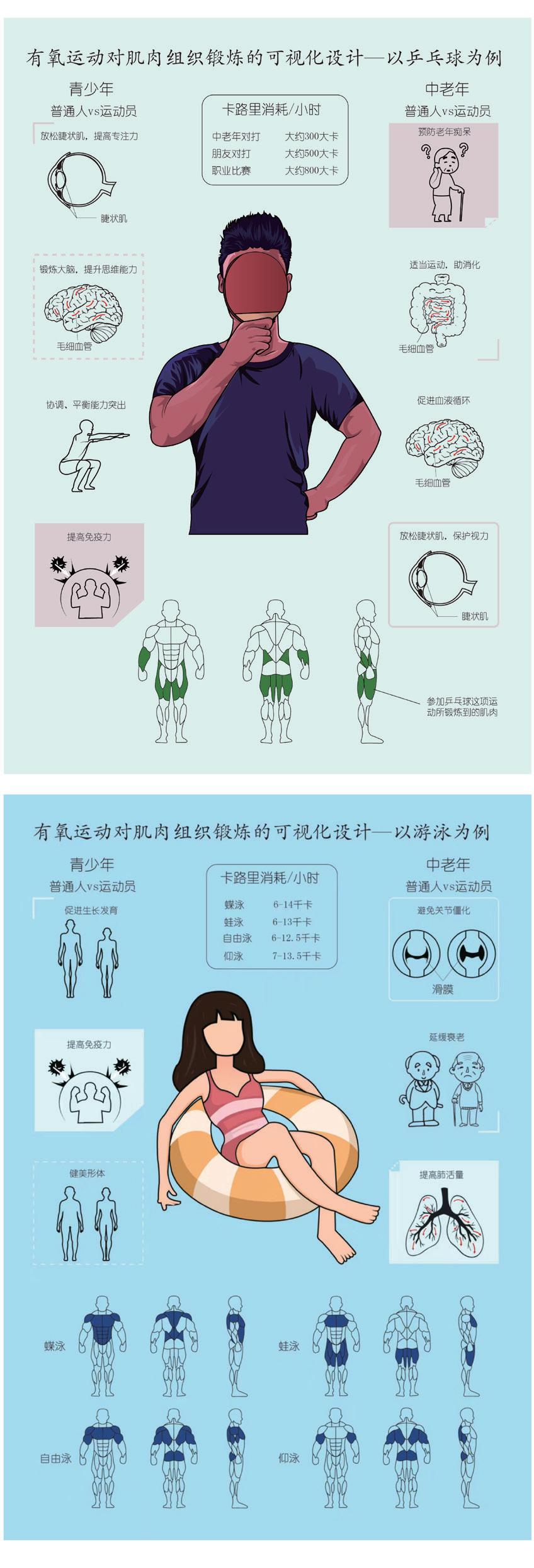
作品名称:有氧运动对肌肉组织锻炼的可视化设计 - 以乒乓球,游泳为例 | Visual Design Of Aerobic Exercise To Muscle Tissue Exercise—Taking Table Tennis And Swimming As Examples
作者:王菡 Wang Hang
指导教师:范奉存 Fan Fengcun
媒材:亚克力 Acrylic
创作时间:2022 年 3 月 22 日 March 22,2022
尺寸:29.7×21(cm)
研究领域:信息图表设计 Infographic Design
创作说明:
该设计主要是体育运动与艺术设计相结合,通过平面信息图表的方式,直观展现出乒乓球,游戏这两项运动对人体各个部位和身体机能的影响,使人们更加深入了解运动,也积极响应由国家提出的“全民健身”的运动方针。该信息图表首先从视觉上吸引大众,从而引导人们深入阅读,了解乒乓球,游泳运动对身体的影响,以达到强身健体的作用。
Description:
The design is mainly a combination of sports and art design, through the way of graphic information chart, intuitive display of table tennis, games these two sports on each part of the human body and physical function of the impact, so that people have a deeper understanding of sports, but also actively respond to the national proposed "national fitness" sports policy. The infographic first visually appeals to the public, so as to guide people to read deeply and understand the impact of table tennis and swimming on the body, so as to achieve the role of physical fitness.

作品名称:视觉健康科学图系设计研究 | Graphic Design For Visual Health Science
作者:袁艺文 Yuan Yiwen
指导教师:袁硕 Yuan Shuo
媒材:亚克力 Acrylic
创作时间:2022年 3 月 12 日 March 12,2022
尺寸:40×40(cm)
研究领域:图系设计 Figure System Design
创作说明:
视觉健康科学图系设计是面向的人们所不甚了解的知识体系,因此通俗化和大众化是设计的必要特征,此设计设计元素提取自视力表和色盲图,通过大量的图形进行秩序感排列,画面运用高斯模糊将设计的作品进行一个模糊化,形成近视人群所看到的样子,制造出一种动态画面,在色彩选择中,大量运用明度较高的颜色,进而产生近视的模糊状态和色盲的颜色混乱进行联合。
Description:
Visual health science figure system design is geared to the needs of the people do not know much knowledge system, so the popularization and popularization are the necessary characteristics of the design, the design design elements extracted from eye chart and color blindness figure, sense of order arrangement through a lot of graphics and images using a gaussian blur will design a blur, works of the formation of myopia people can see, Create a dynamic picture, in the color selection, a large number of high lightness of the color, and then produce the fuzzy state of myopia and color confusion of color blindness.
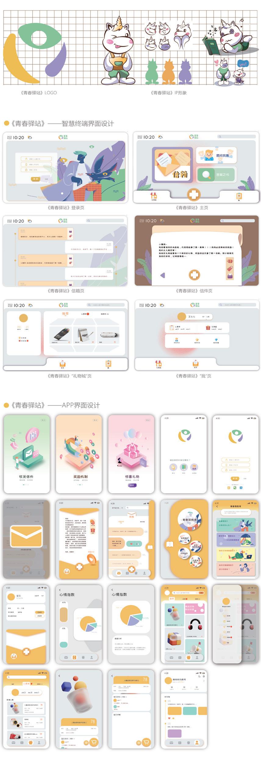
作品名称:基于青春期留守儿童的情感交互系统设计 | Research On Affective Interaction System Design Based On Adolescent Left - behind Children
作者:王雪 Wang Xue
指导教师:蓝天娇 Lan Tianjiao
媒材:亚克力 Acrylic
创作时间:2022 年 4 月 8 日 April 8,2022
尺寸:30×20(cm)
研究领域:系统设计 The System Design
创作说明:
12—16 岁处于青春期的留守儿童开始拥有独立意识,追求自我,对外界展现出更多的好奇心,同时面临着青春期的情感和心理问题。在这一时期的留守儿童,家庭的关爱依旧重要,但是已经不是唯一,此时,学校的正确教育以及社会帮助也尤为重要。因此,笔者致力于以情感化为输出点,探索并提出助力该群体实现“精准关爱”的可行性方式,以智慧终端联合APP 的交互系统作为载体进行设计实践,建立一个新的情感交互系统—“青春驿站”品牌,帮助处于青春期的留守儿童与家、校、社会进行双向情感交流。
Description:
Left-behind children at the age of 12 to 16 begin to have a sense of independence, pursue themselves, show more curiosity to the outside world, and face emotional and psychological problems in adolescence. For left-behind children in this period, family care is still important, but it is not the only one. At this time, correct school education and social help are also particularly important. , therefore, the author devotes to emotion into dots, explore and put forward the power of this group implement the feasibility of the "precision caring about" approach, with APP interaction system of intelligent terminal as carrier to carry on the design practice, set up a new emotional interaction system - "youth post" brand, to help adolescent leftbehind children and family, school and society totwo-way communication.
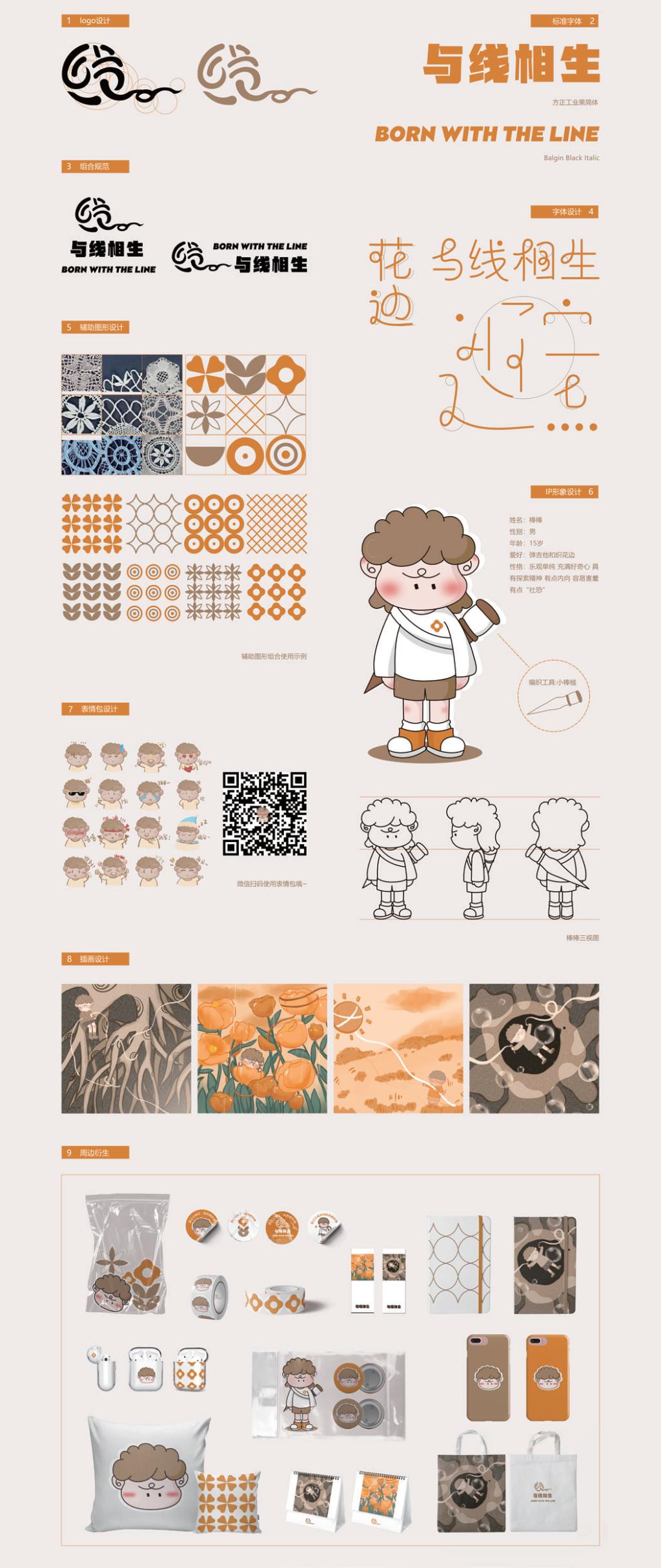
作品名称:《与线相生》棒槌花边技艺视觉设计 | Living With Thread Visual Design Of Mallet Lace Technique
作者:盛雅婷 Sheng Yating
指导教师:郎雯 Lang Wen
材质:棉质面料 胶版印刷 Acrylic Vacuum Plastic Bags , etc
创作时间:2022 年 3 月 20 日 March 20,2022
尺寸:30×30(cm)
研究领域:IP 文创设计 IP Cultural Design
创作说明:
《与线相生》设计名称源于“以线构成万物”,意味着不断更新延续,贯穿始终。棒槌花边主要是用棒槌将棉线进行绞、钩、拉等技法编织而成,而花边主要是由“线”构成,所以本设计以“线”为主要灵感来源。在对烟台栖霞进行实地调研后,提取了与花边相关的众多元素,例如“棒槌”、“线”、“花边花纹”等,对其进行创意性设计。
Description:
The design name of "Living with Line" originates from "making everything with line", which means continuous renewal and continuity throughout. Mallet lace is mainly woven with mallet to twist, hook, pull and other techniques, and lace is mainly composed of "line", so this design to "line" as the main source of inspiration. After a field survey of Yantai Qixia, we extracted many elements related to lace, such as "sticks", "lines" and "lacy patterns", and carried out creative design for them.
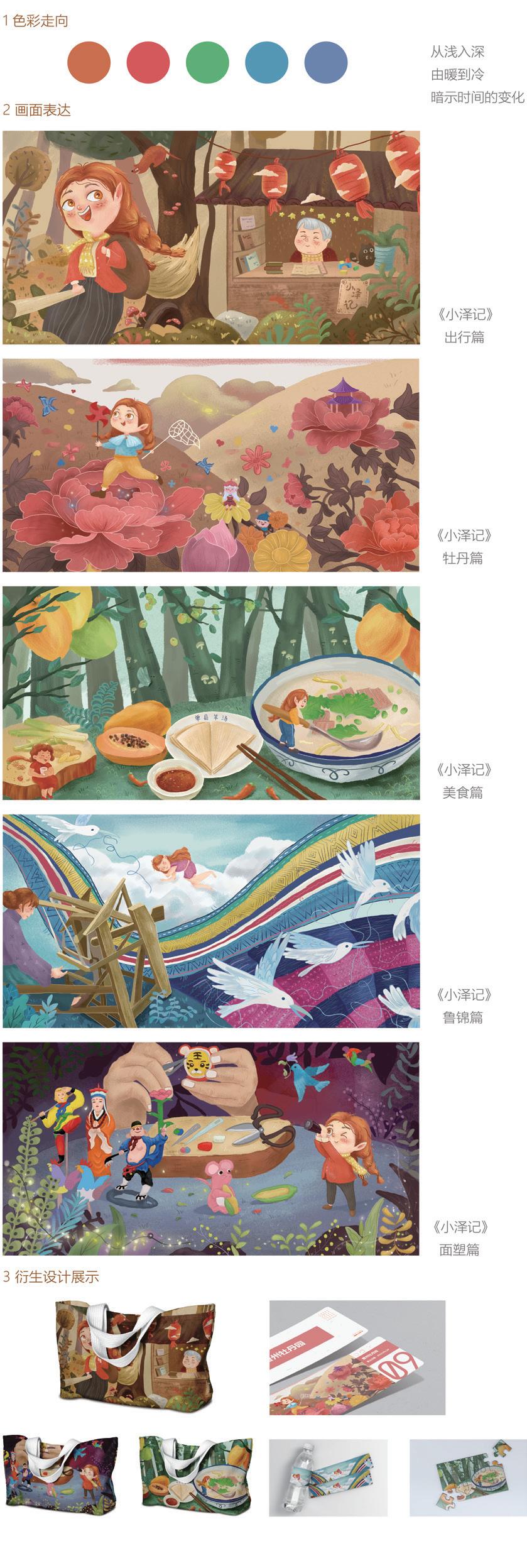
作品名称:基于菏泽印象的儿童插画及衍生设计研究 | Research On Children’s Illustration And Derivative Design Based On Heze Impression
作者:崔祎 Cui Yi
指导教师:马熙逵 Ma Xikui
媒材:丝网印刷 Silk - Screen Printing
创作时间:2022 年 3 月 15 日 March 15,2022
尺寸:43×22(cm)
研究领域:儿童插画及衍生设计研究 Children’s Illustration and Derivative Design
创作说明:
采用儿童插画形式展开系列性视觉设计研究,通过对菏泽地域文化进行深入的分析挖掘,并紧密围绕“儿童插画”与“传统文化”两大板块进行设计,通过对儿童插画国内外发展现状和菏泽地域文化分析,在造型色彩上进行设计,绘画出这一组名为“小泽记”的儿童插画,并对该组儿童插画进行衍生设计研究,以达到拉近儿童与地域文化的联系进而增强文化自信的目的。
Description:
In the form of children's illustration series visual design research, through the analysis of heze regional culture indepth excavation, and closely around the "illustrations for children" and "traditional culture" two plates to carry on the design, through the illustrations for children development present situation at home and abroad and the analysis of regional culture of heze, on modelling colour design, painting out of this group is called "Mr Ozawa's" children's illustrations, And the derivative design research of the children's illustrations is carried out in order to achieve the purpose of shortening the connectionbetween children and regional culture and thus enhancing cultural confidence.
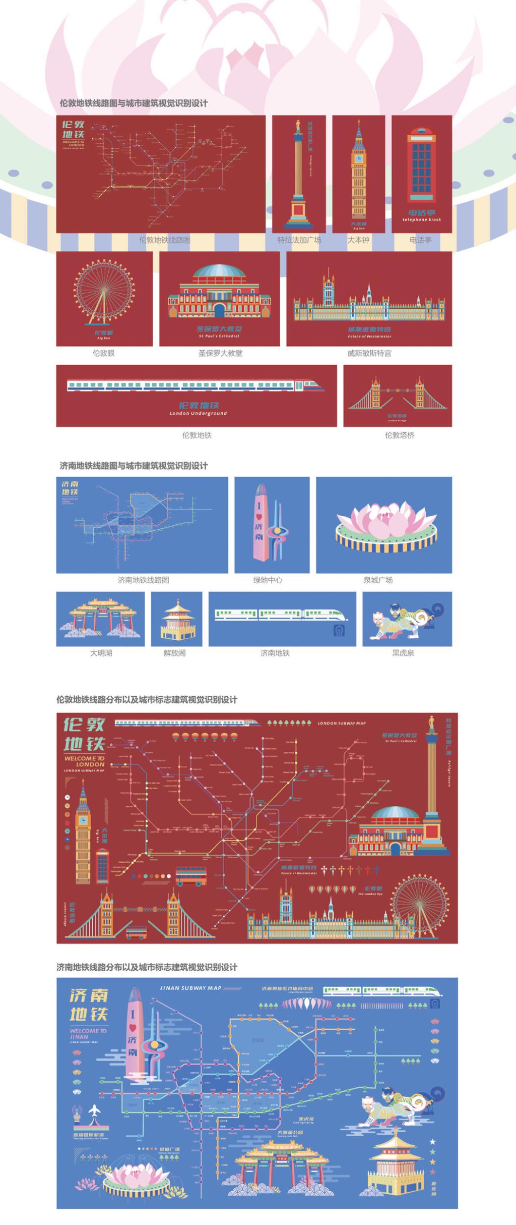
作品名称:从济南到伦敦地铁线路动态视觉识别设计 | Dynamic Visual Identification Design From Jinan To London
作者:韩雅唯 Han Yawei
指导教师:袁硕 Yuan Shuo
材质:动画播放 The Flash
创作时间:2022 年 4 月 12 日 April 12,2022
尺寸:1920×1080(px)
研究领域:动态视觉识别设计 Dynamic Visual Recognition Design
创意说明:
该动态视觉识别设计采用动态化的方式表现当代最受欢迎的交通方式之一地铁,并研究地铁在济南和伦敦两座城市中的线路设计,文化和艺术形态。同时展示了两城地铁线路的发展,并结合了笔者对两城建筑艺术的理解。笔者主要使用扁平插画风格去设计并绘制了从济南到伦敦的地铁和城市元素,运用丰富的色彩表达形成了较强的视觉冲击力效果,最后再用更具有趣味性的动画方式呈现出来。
Description:
The dynamic visual identification design uses a dynamic approach to represent the subway, one of the most popular modes of transportation in the contemporary world, and studies the line design, culture and art forms of the subway in Jinan and London. It also shows the development of subway lines in the two cities and combines the author's understanding of the architectural art in the two cities. The author mainly uses flat illustration style to design and draw the subway and urban elements from Jinan to London, and uses rich color expression to form a strong visual impact effect, and finally presents them in a more interesting animation way
美 国 拿 撒 勒 大 学
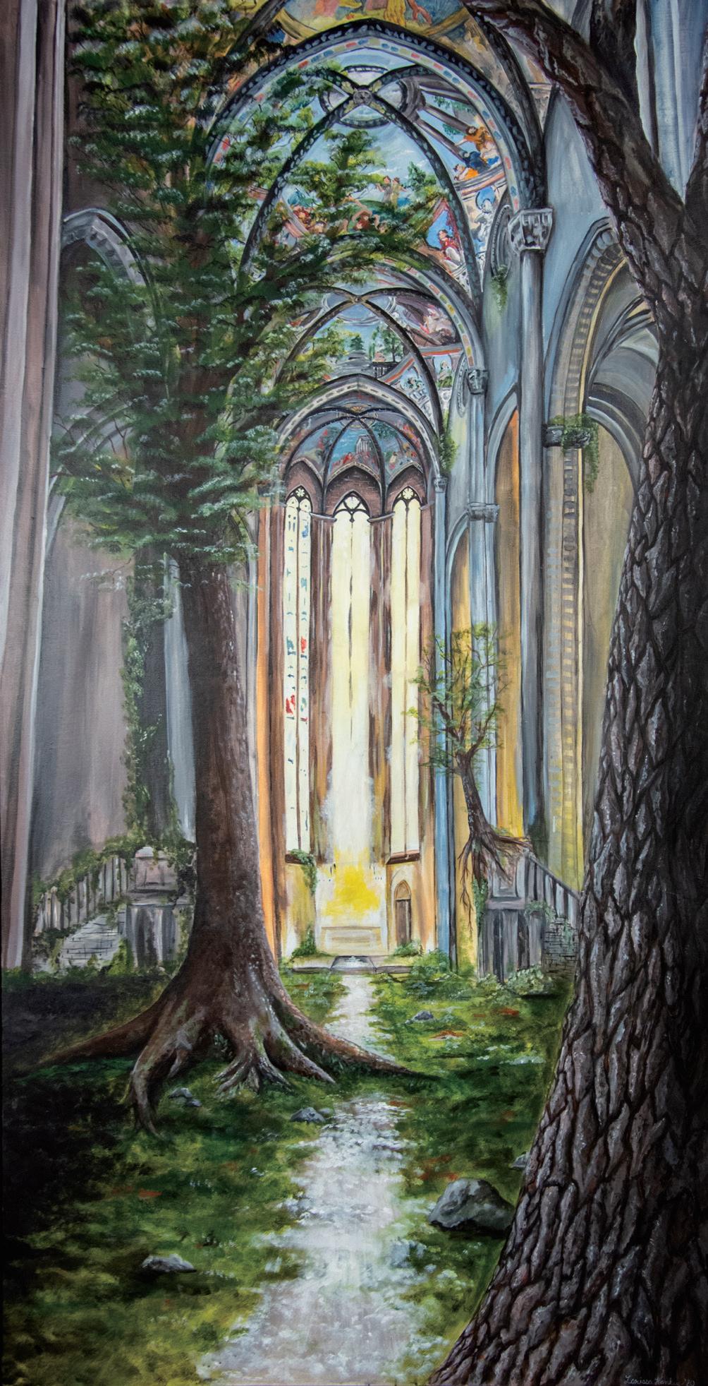
Title: Overgrown | 蔓延
Name:Larissa Hankey 拉里萨·汉基
Instructor: Ron Netsky
Medium: Acrylic 丙烯
Date of Completion:11/5/ 2021
Size: 3.5ft x 7ft
Area of Study: Painting 绘画
Creative Idea Behind the Project (Artist Statement):
Life finds a way; nature will reclaim. I work in a variety of mediums but mainly create acrylic paintings, ceramic sculptures, and dance films to portray my message. Inspired by my travels to Brazil and Italy, historical ruins, and life experience I explore different ways in which nature takes back what it once had. I strive to combine my love for the outdoors and architecture in a cohesive manner, which typically involves trees, vines, and other greenery seeping its way into buildings and other manmade objects. My work comments on the perseverance of nature which can result in both beauty and destruction.
创作说明:
生活找到了一条路;自然会恢复的。我在各种媒介中进行创作,但主要创作丙烯画、陶瓷雕塑和舞蹈电影来表达我的信息。受巴西和意大利之旅、历史遗迹和生活经历的启发,我探索了大自然夺回曾经拥有的东西的不同方式。我努力将我对户外的热爱与建筑融为一体,这通常涉及树木、藤蔓和其他绿色植物渗透到建筑和其他人造物体中。我的作品评论了大自然的不屈不挠,这会导致美丽和毁灭。
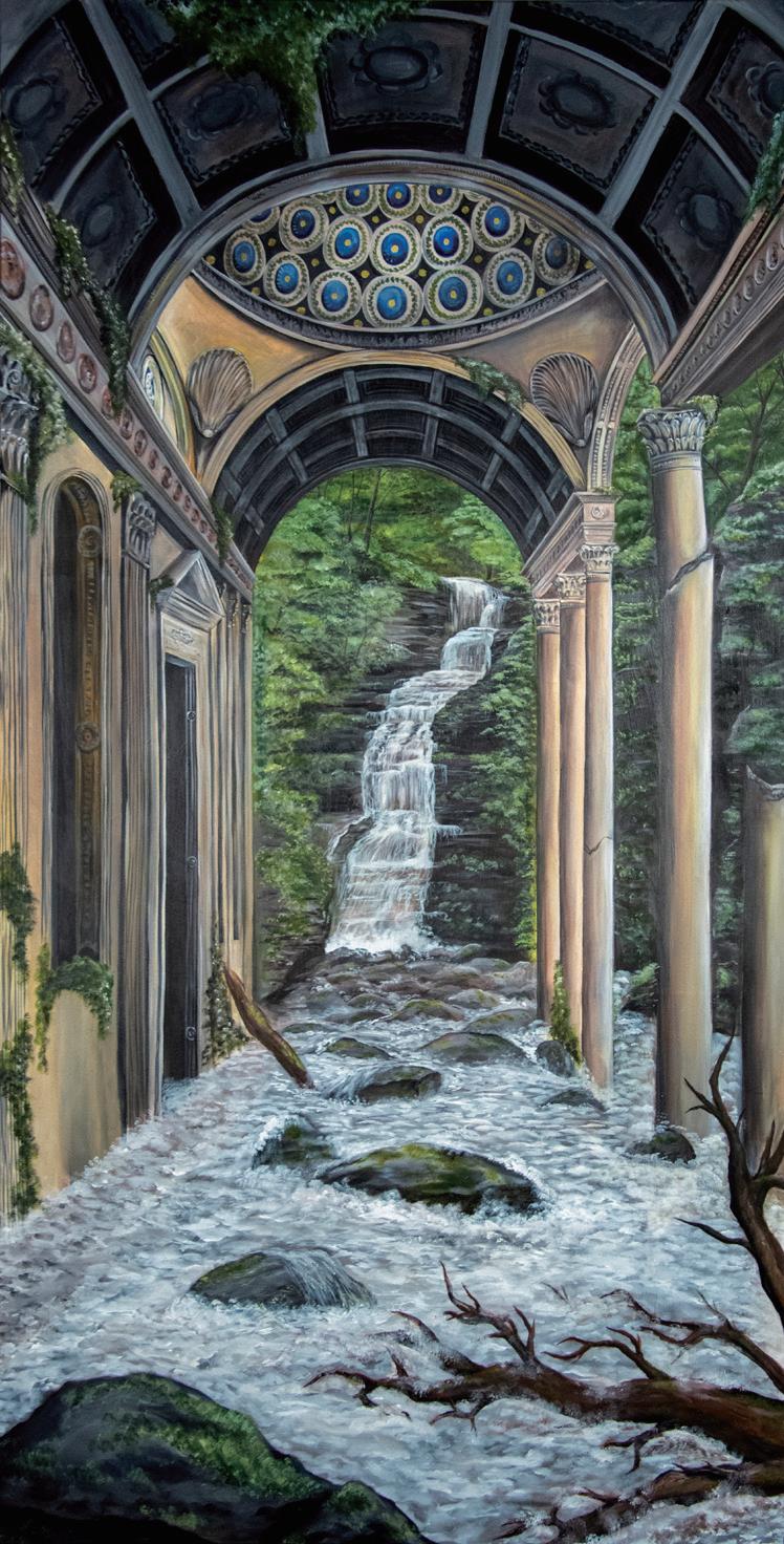
Title: Invaded | 侵略
Name:Larissa Hankey 拉里萨·汉基
Instructor: Ron Netsky and Stefan Zoller
Medium: Acrylic 丙烯
Date of Completion:11/5/ 2021
Size: 3.5ft x 7ft
Area of Study: Painting 绘画
Creative Idea Behind the Project (Artist Statement):
Life finds a way; nature will reclaim. I work in a variety of mediums but mainly create acrylic paintings, ceramic sculptures, and dance films to portray my message. Inspired by my travels to Brazil and Italy, historical ruins, and life experience I explore different ways in which nature takes back what it once had. I strive to combine my love for the outdoors and architecture in a cohesive manner, which typically involves trees, vines, and other greenery seeping its way into buildings and other manmade objects. My work comments on the perseverance of nature which can result in both beauty and destruction.
创作说明:
生活找到了一条路;自然会恢复的。我在各种媒介中进行创作,但主要创作丙烯画、陶瓷雕塑和舞蹈电影来表达我的信息。受巴西和意大利之旅、历史遗迹和生活经历的启发,我探索了大自然夺回曾经拥有的东西的不同方式。我努力将我对户外的热爱与建筑融为一体,这通常涉及树木、藤蔓和其他绿色植物渗透到建筑和其他人造物体中。我的作品评论了大自然的不屈不挠,这会导致美丽和毁灭。
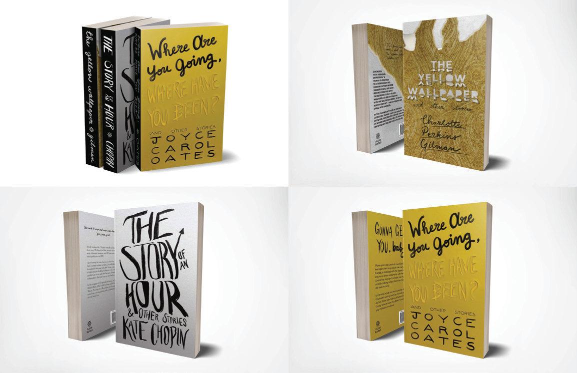
Title: Short Stories Book Cover Series | 短篇小说封面系列
Name:Megan Ruffalo 梅根·鲁法洛
Instructor: Steve Wehner
Medium: Digital (Photoshop, InDesign, and Procreate) 数字设计
Date of Completion: 10 / 2 /2021
Size: 17in x 11in
Area of Study: Graphic Design 平面设计
Creative Idea Behind the Project (Artist Statement):
Short stories often receive very boring or drab book covers . So , I wanted to give some of my favorite short stories a new life with some fresh , thoughtful book jacket designs . Each cover has a typography - focused design using my own hand - drawn type .
创作说明:
短篇小说的封面通常非常枯燥乏味。所以,我想用一些新鲜、深入的书套设计,给我最喜欢的短篇小说注入新的活力。每个封面都有一个以排版为主的设计,使用我自己的手绘字体。
Title: Ruffink Logo Design Ruffink | 标志设计
Name:Megan Ruffalo 梅根·鲁法洛
Instructor: Steve Wehner
Medium: Digital (Adobe Illustrator) 数字设计
Date of Completion: 12 / 3 /2021
Size: 17in x 11in
Area of Study: Graphic Design 平面设计
Creative Idea Behind the Project (Artist Statement):
There is something really special about connecting with someone through hand - written notes , be it in letters , cards , or passed notes . For yeas Ihave made cards to give to my family and friends on special occasions ( or sometimes just because ). Iadore good ol ' fashioned snail mail , and so , I created the branding for a fictitious stationary company caled Ruffink 一“ Ruff ' as in the first four letters of my last name and “ ink ” as in the ink used to write or draw , but also a fun play on “ inc ” as in “ incorporated .” Ruffink creates unique , hand - illustrated greeting cards and other paper goods and believes that everyone should send more letters .
创作说明:
通过手写的笔记与人交流真的很特别,无论是信件、卡片还是传递的笔记。多年来,我一直在制作卡片,以便在特殊场合(或有时只是因为这样)送给家人和朋友。我喜欢老式的蜗牛邮件,因此,我为一家虚构的文具公司创建了品牌,名为 Rufink ," Ruf "是我姓氏的前四个字母," ink "是用来书写或绘画的墨水,也是对“ incorporated ”中" inc "的有趣发挥。Rufink 创建了独特的手绘贺卡和其他纸质产品,并认为每个人都应该发送更多的信件。
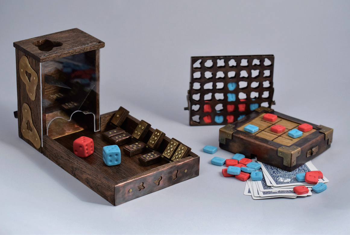
Title: Treasure Me, Play | 珍惜我,玩儿吧
Name:Mirabelle Sprinkle 米拉贝尔·斯普林
Instructor: Holland Houdek
Medium: Brass, Copper, Wood, Polymer Clay 黄铜、铜、木材、聚合物粘土
Date of Completion: March 3,2022
Size: Dimensions vary 尺寸各不相同
Area of Study: Metals 金属
Creative Idea Behind the Project (Artist Statement):
There is a time to be serious. And there is a time to play. This interactive piece—a fusion of nostalgic childlike games—can be a reminder that we ought not to lose our sense of playfulness.
创作说明:
现在是认真对待的时候了。还有时间玩。这一互动作品融合了怀旧的童趣游戏,可以提醒我们不应该失去玩耍的感觉。
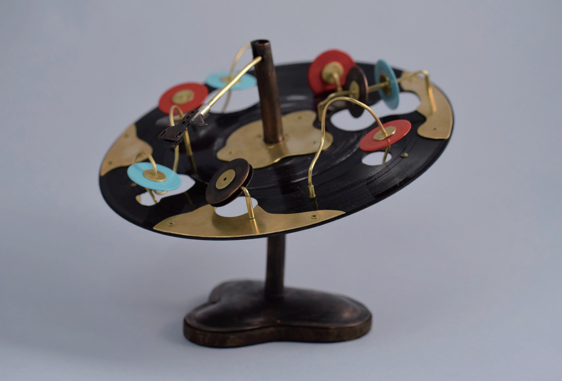
Title: Broken Record: Redefined | 打破记录:重新定义
Name:Mirabelle Sprinkle 米拉贝尔·斯普林
Instructor: Holland Houdek
Medium: Brass, Copper, Vinyl 黄铜、铜、乙烯基
Date of Completion: April 7,2022
Size: 7in×6.5in
Area of Study: Metals 金属
Creative Idea Behind the Project (Artist Statement):
I’ve struggled with hearing loss for most of my life. Even more, I’ve fought to not see myself as a person who is broken or “less than” simply because I am incapable of functioning in ways that fit within the standard norms.Some may look at this vinyl and consider it defective. Others may recognize that although it has been repurposed beyond its intended use, it is still functional. Similarly, if another person is not operating or behaving in way in which they are expected to, it does not mean they are broken. This playful piece highlights the value of breaking free from societal expectations and presumptions.
创作说明:
在我生命的大部分时间里,我一直在与听力损失作斗争。更重要的是,我一直在努力不把自己看成是一个残缺的人或 "不如人 "的人,只因为我无法以符合标准规范的方式运作。有些人可能会看到这个黑胶,认为它有缺陷。其他人可能会认识到,它被重新利用,超出了它的预期用途,但它仍然是有用的。同样,如果另一个人的操作或行为方式不符合他们的期望,这并不意味着他们是坏的。这个有趣的作品强调了摆脱社会期望和假设的价值。
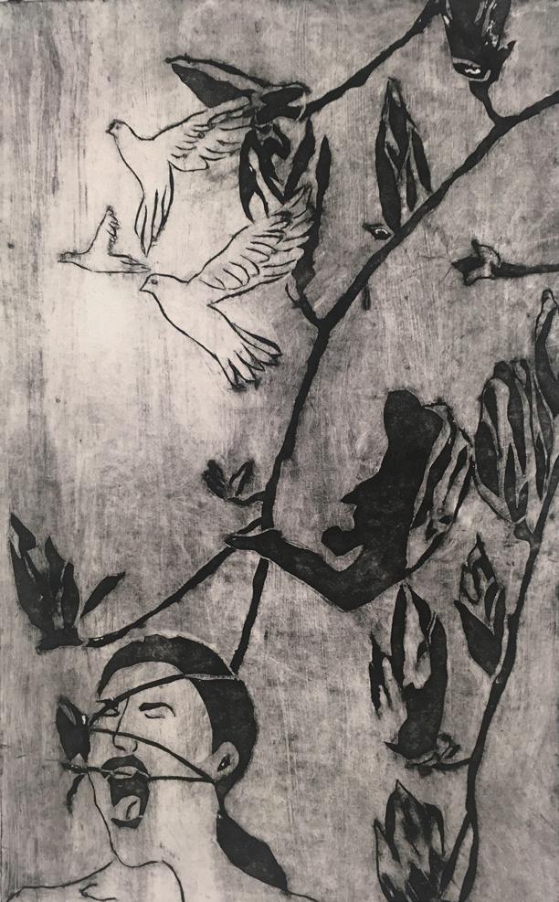
Title: Crazy | 疯狂
Name:Olivia Lawrence 奥利维亚·劳伦斯
Instructor: Ron Netsky
Medium: Cradigraph
Date of Completion: Fall 2021
Size: 8in x 13in
Area of Study: Printmaking 版画
Creative Idea Behind the Project (Artist Statement):
Within my art, I had noticed that birds, plants, and the human figure were elements that were naturally recurring in my compositions. I wanted to explore why these three elements were in my subconscious. My artwork deals with the manipulation and juxtaposition of these three elements to express the emotions that I was feeling subconsciously at the time of making each piece. When creating a composition I don’t meticulously plan every detail. Generally, I try to find imagery of one of the elements in the moment that I like and piece all of the remaining elements together as I go. constantly changing the positions and scale of each until it seems right.When creating the plate I started with positioning the figure in the bottom left of the composition. I liked the expression of anger and frustration that the figure had. Next, I placed the plants, finding a position that I felt drew attention to the figure. Lastly, I put the group of three doves into the composition. Making it seem that they were flying away from or out of the figure. I created the plate for this piece during the summer of 2021. At the time there were still many restrictions in place because of the coronavirus pandemic. After seeing the final printed version of this plate I remember feeling particularly frustrated with the situation when creating the plate. For me This piece symbolizes the frustration and anger felt during the pandemic and the hope that eventually life would go back to normal.
创作说明:
在我的艺术中,我注意到鸟类、植物和人物是我作品中自然重现的元素。我想探究为什么这三种元素存在于我的潜意识中。我的作品处理这三个元素的操作和并置,以表达我在制作每件作品时潜意识中感受到的情感。在创作一篇作文时,我并没有仔细规划每一个细节。一般来说,我会在我喜欢的时刻找到其中一个元素的图像,然后在我走的时候把剩下的元素拼凑在一起。不断改变每一个的位置和规模,直到它看起来是正确的。在制作这个盘子的时候,我先把这个人物放在构图的左下角。我喜欢这个人物那种愤怒和沮丧的表情。接下来,我放置了这些植物,找到了一个能吸引人们注意的位置。最后,我把三只鸽子放进构图中。让他们看起来像是飞出或离开了这个数字。我在2021夏天为这件东西制作了盘子。当时,由于冠状病毒大流行,仍有许多限制措施。在看到这个盘子的最终印刷版本后,我记得我对制作盘子时的情况感到特别沮丧。对我来说,这件作品象征着大流行期间的沮丧和愤怒,以及最终生活将恢复正常的希望。
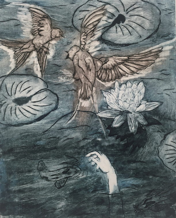
Title: Reflection Pool | 反射池
Name:Olivia Lawrence 奥利维亚·劳伦斯
Instructor: Ron Netsky
Medium: Cradigraph
Date of Completion: Spring 2021
Size: 8.75in x 11in
Area of Study: Printmaking 版画
Creative Idea Behind the Project (Artist Statement):
Before creating this piece I hadn't explored there being water in any of my pieces. I wanted to use a body of water as a setting for the birds fighting. I liked the way the position of the reaching hand and fighting birds were a juxtaposition to the calming atmosphere that the water, fish, and water lily create.
创作说明:
在创作这幅作品之前,我从没有在我的作品中探索水的出现。我想用一片水域作为鸟儿们搏斗的场景。我喜欢伸出的手和搏斗的鸟与水、鱼和睡莲创造的平静气氛形成的强烈反差。
